About the Client:
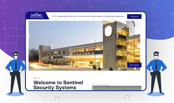
Sentinel Security is an innovative and quality-driven provider of a complete range of electronic security systems solutions. It is a well-established name in providing security solutions. Established in 2001, Sentinel Security is a part of Sentinel Engineering Ltd who are synonymous with high standards and integrity in business since the Company’s formation.
They are fully licensed and accredited members of the Private Security Authority, the Management System Certifications, and members of DHF and the Gate Safety Federation.
Sentinel Security has been awarded many times for providing the best security solutions to its customers. GraffersID is always up for working with esteemed brands in the market. We were very excited to create the landing page for sentinel security. Since its deployment, the UI has attracted many visitors to the website.
Features of the Landing Page
GraffersID has a habit of conducting extensive research before starting work on any project. Along with these, we conducted meetings with the founders of the company to clarify all the requirements for the page. Our development and design team had to focus mostly on the front-end part of the project.
For this project, expertise in UI/UX design and development was required. As GraffersID has a lot of experience in similar projects, the client was confident in getting it developed by us.
Given below are some of the features that make Sentinel Security’s landing page highly responsive and unique.
1. Dynamic slides
Grabbing a visitor’s attention is extremely important for any website. That is why the development team of GraffersID has added dynamic portfolio slides in the Landing Page of Sentinel Security. These slides are going to ensure that a visitor stays on the site long enough to check it out.
Adding the company’s portfolio in the slides is also going to show the visitors their previous work. This will help them in attracting potential customers.
2. Interactive product graphics
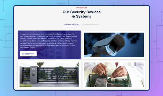
The Founders wanted to display all their products and information uniquely. GraffersID’s design team conducted brainstorming sessions to find a way to make this possible. During one of these sessions, one member of the team came up with the idea of putting interactive images on the landing page.
These images are of the products available at Sentinel Security. Once a visitor clicks on these images, they can see detailed information about the product.
3. Long scrolling
Following the latest trend concerning landing page scrolling methods, the Sentinel Security Landing Page works on the long scrolling model. This allows the user to see every element on the same page one by one.
The GraffersID UI UX designing and development team has used the long scroll feature to create a storytelling effect on the landing page to capture the visitor’s attention almost instantly. It allows the page to hold the visitor’s attention.
With long scrolling, a visitor won’t be able to just take a glance at the page and see everything. While this is convenient for the user, it is also found that this leads the visitors to leave the page quickly, even without checking out all services properly.
To avoid this, GraffersID added the long scrolling feature. This way a person gets tempted to check out the whole website.
4. Internal Linking
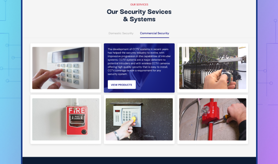
Linking the landing page has a crucial role in the website development process. It can be used to contribute to the digital marketing campaigns of the client. By linking a social media page of a company to the landing page, contacting the company becomes very easy for visitors.
That is why both the front end and the backend development team of GraffersID have efficiently collaborated to create simple yet effective links between various components of the website. This also helps search engine crawlers in indexing the website and ensures better search engine rankings.
5. Quick Loading
The loading speed of any website or landing page needs to be fast to hold a visitor’s attention. During the research, the development team found that 90% of visitors left the site because it took too long to load.
Keeping this in mind, the GraffersID development team ensured that the landing page loads up quickly. This way when a visitor lands on the page, they don’t have to wait too long for the content.
6. Easy navigation
Having the long scrolling model, the landing page becomes considerably easy to navigate. But with so many elements on the landing page, the long scrolling model was not sufficient to provide a smooth User experience. For this purpose, our design and development team has created an easily accessible UI.
The design team has added a navigational assistant to the landing page. This button allows the visitor to get to any particular location on the page.
7. Quick links
Quick links are another way to provide a smooth UX to the user. They make everything available to the user in just one click. The Design and development team at GraffersID wanted to give a clean look to landing while making things accessible to the users.
Every product image has been added with a link. When clicking on that link, the user is taken to a page where they can get more information about the particular product.
8. Extensive Testing
While a landing page may function normally under development conditions, it does not guarantee that it is going to perform similarly in real-life conditions.
This may occur due to many reasons like – variations in traffic load and data speeds. The development team at GraffersID has done a lot to alleviate this problem. They performed extensive testing of the landing page under stressful situations. This ensured the optimal page performance even with the high traffic loads or low data rates.
9. Security
The landing page is designed to collect data about users. This data allows the website to generate personalized results. But Security is important for every visitor. During the research, the design team at GraffersID found that security is the biggest concern of customers.
To ensure that the security of a visitor is not compromised, our team has embedded standard security protocols on the page.
These protocols ensure complete encryption of data that travels between the servers and the landing page. Moreover, the landing page is integrated with a notification system that alerts the page administrator about any cyberattacks on the page.
10. Responsiveness
In contrast to the past, the number of users accessing the Internet with the help of the mobile phone has seen a huge growth in recent years. Because of this responsiveness has become one of the key factors in web development.
Aware of this change, our UI/UX designing team has also kept responsiveness as one of the top priorities while developing the landing page. GraffersID’s design and development team has ensured that the site works similarly on different devices with the help of technologies like bootstrap. Since more search engines now prefer a mobile-friendly site, responsiveness also allows the landing page to get better rankings on the search engine results.
11. Product Oriented Design
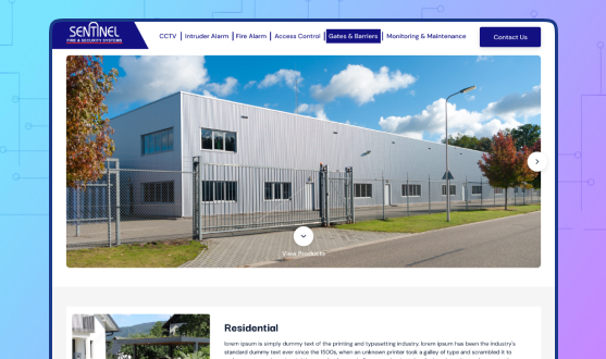
For the UI/UX design and development team at GRAFFERSID, the job isn’t just to develop websites and landing pages but to create platforms that bring returns for the clients.
The landing page is designed for a client that provides security solutions to their customers. The team focused on creating a design that allowed the company to easily exhibit all of its products on the page. This way the customer will get more information about the product and services, which in turn, is going to create better returns for the Client.
12. Cross-browser compatibility
The browser a visitor uses to navigate the landing page plays an important role in the visual experience of the website. Each browser follows an HTML protocol that is slightly different from its other browsers which makes the landing page look different on different browsers.
The design and development team at GraffersID has made sure that the landing page is fully compatible with all the popular browsers through debugging and making changes to the interface code.
13. Social media integration
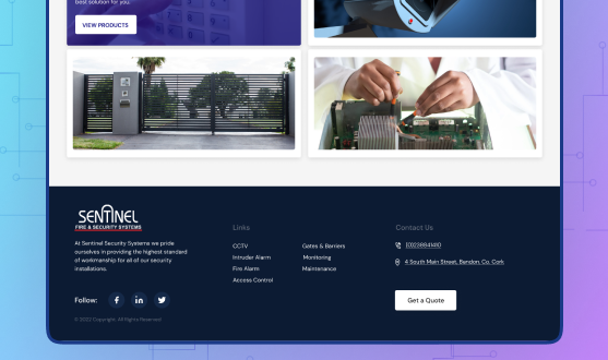
Each landing page is a part of the company’s digital marketing strategy that is geared towards bringing in new leads. But, the biggest place to get these leads are social media platforms where the majority of the population spends their time.
With this in mind, the design and development team has integrated the links to the social media pages of the client in form of buttons on the footer of the landing page. It gives the user an option to get associated with the social media page of the business just with one click.
What did the client say?
Contacting GraffersID for our project was the best choice we made. They were very enthusiastic about it from the research to the completion. Their dedication to completing a project successfully and within the timeline is admirable.
Working with them has been a very wonderful experience for us. We are very happy with how the project turned out after completion. We received many great reviews after its deployment.
We happily recommend GraffersID to anyone looking to build a brand.
