About the Client
Aryng is an innovative approach to solve the data knowledge problem of the industry. Even after having lots of data, using it is still a huge problem.
Solving his major issue, Aryng has developed an Academy platform where anyone can learn about the most precious aspect of the Digital World.
Aryng Founders wanted to make a website that is just like an institute. Covering all aspects of learning, Aryng also wanted to stay in touch with the advancing world.
Connecting educational material from the web which gets updated regularly solved the issue and made Aryng a partner for data science enthusiasts as well as professionals in no time of launch.
The launch of Aryng was successful and gained huge traction within the first month. It was vastly appraised for seamless interfaces and no lagging during data display.
The team of GRAFFERSID enabled Aryng to deliver exceptional value to users and have the highest retention rate.
Features of the Aryng Website
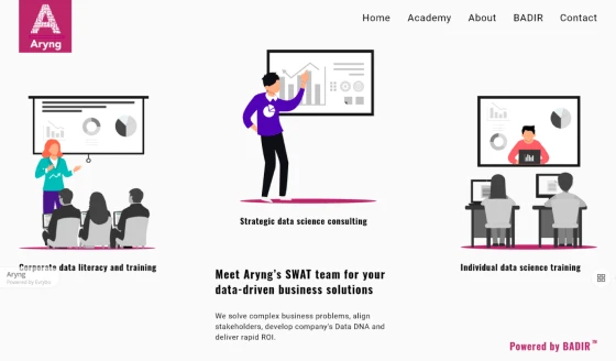
Aryng website had the challenge of incorporating a training house page that had to contain everything and all media-type files. To present the best quality work, we made sure that Aryng website is clearly taking every user to that Academy page.
The Academy page was itself a landing page that worked like a Homepage for the Training Part of it. Understanding the need of the Industry, Aryng also offers data science consultation to businesses.
Showcasing all of this in one platform was something different but not tough for the tech-savvy team of GRAFFERSID.
1. Search Bar
As the website contains a plethora of elements on the page, first the team needed to ensure the availability of content to the users in an instant. That is why the UI/UX designing team focused on lacing the website with a search bar with an auto recommendation feature.
This assists the user by providing them with suggestions based on the phrases a visitor searches. Further, the search results are segregated into different sections based on their location to make it more clear for the user.
2. Site Caching
With a goal to make the website load faster, the UI/UX design and development team has leveraged the site caching feature. This allows the servers to store readymade results to general queries and actions in the RAM.
Hence when a user searches or clicks on a particular element, the server can instantly return the result without any delay which can result in better search engine rankings.
3. Clean and Commented Code
Though everyone focuses on the external part of a website or landing page what actually makes a page good-looking and efficient is its code.
Therefore the team at GRAFFERSID has warranted that the code is clean and well commented through optimization sessions.
With this, the client can easily enhance the features of the page in the future. Additionally, this can save a lot of time and resources in case there is a need for any changes or rectifications.
4. Contact Form
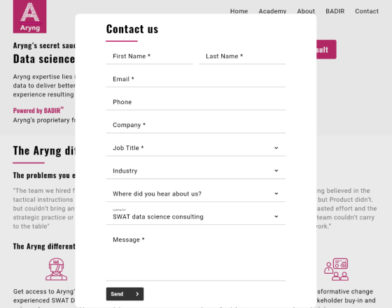
As a website development company, GRAFFERSID understands the importance of lead generation capabilities of a website. Hence to augment the lead generation process, the development team has integrated the site with different forms as per the business needs of the client.
Along with this, the backend team has ensured that there is proper storage and security of this information so that it can be referenced later by the client.
5. Dynamic Slides
This particular feature has been integrated by the website development team on all the important pages of the website. The dynamic slides dashboard has been leveraged to show testimonials and blog recommendations.
This has saved a lot of space for the website contributing to clean UI and more space for other elements on the pages. While the backend team has also worked to make it more responsive keeping in mind the wide range of devices available out there.
6. Intra Site Linking
The site contains multiple pages and sections, hence to make it easier for the visitors to explore the website, it is integrated with intrasite linking. Here all the pages of the website are connected and perform in synergy all together.
Additionally, this also acts as a facilitator for the SEO ranking of the website by helping the indexing bots of the search engine in crawling the website.
7. Aptitude Assessment Dashboard
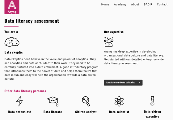
The aptitude assessment dashboard is a special feature integrated into the website so that the users can test their cybersecurity understanding.
Further, the backend team has worked to ensure the smooth functioning of this feature on the server end as there are continuous submission and retrieval of data.
While to provide the user with quick results regarding the assessment, the site uses a custom algorithm created by the developers which checks the tests and provides instant results to the users.
8. Chat
To allow the visitor to contact the client, the site contains a chat feature through which the visitor can carry out the required conversation with the company.
However, to decrease the load in case of high traffic, the site is equipped with a chatbot that can carry out simple conversations and help in the lead conversion.
Also, the chatbot has the capabilities to store the chat so that it can be later referenced by the client to get new insights.
9. Custom icons and Illustrations
![]()
Following our standards of originality, the dedicated developers at GRAFFERSID have used custom icons and illustrations for the website instead of using generic ones.
The UI/UX thoroughly researched the requirements and target audience to create icons and illustrations that create the maximum impact on the visitor.
Likewise, the development team has ensured that these icons and illustrations are well integrated with the website and work smoothly throughout.
10. Blogs Dashboard
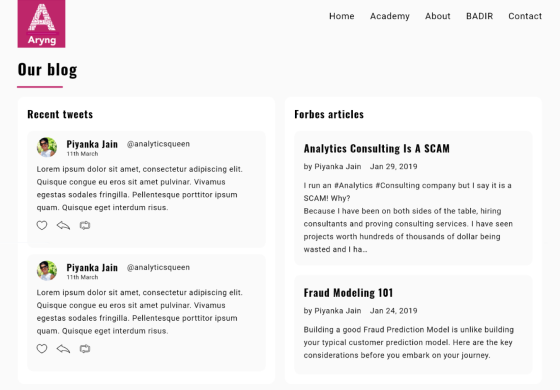
Content has always been a great magnet for quality leads, to allow the client website to present their blog content effectively, the site has a dedicated blog page.
The layout of the page is designed in the form of grids to provide a clear and intuitive look to the blog. While it also has the content editor panel for the client to edit and upload new content and see analytics for the content already uploaded.
11. Social Media Integration
The development team always kept the focus on the connectivity factor of the website as it helps in bringing in new visitors as well as forming credibility.
The design team has used custom icons of social media sites linking directly to the social media page of the client. This helps the visitors to access the company’s digital presence over social media with just a click of a button.
12. Notification and Alerts
For a website containing features like chat and aptitude tests, it needed to have a mechanism to inform the user about any new development on the website.
Hence the frontend development team has laced the site with a swift notification and alert system that informs the user about any new message from the website.
Keeping in mind the privacy of the user, the site follows a permission protocol before showing notifications to avoid creating any unnecessary disturbance for the user.
13. Google Analytics Integration
To make further improvements in the digital marketing approach, a website requires regular data relating to the user behavior on the site. To fulfill this, the development team has integrated the popular Google analytics program with the site.
This allows the client to get valuable insights into the background of the user like their location and user behavior which helps in making fruitful conclusions for the future approach.
14. Security
A website sends and receives a decent amount of data between itself and the servers of the client. However, it is equally important to ensure the safety of this data from reaching unwanted hands like hackers.
To warrant this the team has used high-security standard protocol HTTPS which encrypts all the data traveling among the website and servers, protecting it from a breach in case of any cyberattacks.
15. Typography and CTA
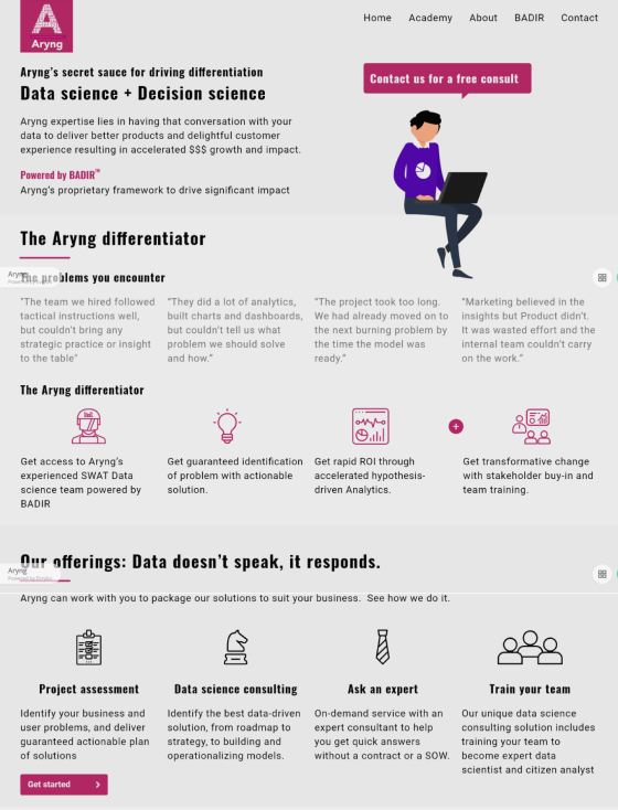
As a UI/UX design company, GRAFFERSID has worked on multiple projects belonging to different industries. However, all of them have required distinct typography and presentation of textual information which compliments their business.
Similarly, the design team has paid strong attention to typography which has resulted in greater user engagement. Likewise, the call to action has been designed while keeping in mind the target audience of the client company to bring in quality leads.
16. Server and Backend
While the outward appearance of the website is important what’s more important is the backend performance of the site.
Using the efficient data structure models, the backend developers at GRAFFERSID have created an efficient storage and retrieval approach. This lets the site have numerous elements and work at an optimum level with minimum server space.
Further, the backend development has been done keeping in mind the future scalability prospects to make the site more flexible to new improvements.
17. Responsiveness
Contrary to the older times, the majority of internet traffic comes today through mobile phones and similar devices. Hence it becomes crucial that the site is flexible enough to adapt to the myriad of operating environments available out there.
The frontend development process of the website has included responsiveness as a crucial factor making it ready for devices with different screen sizes and operating systems.
18. Animation and Hover effect
To add more interactivity to the otherwise static-looking page, the UI/UX team has used animations and hover effects using their previous experience with mobile app development projects.
Instead of using autoplay animations, the team has used trigger animation which only plays through specific actions like scrolling and hover, thus saving a lot of resources and decreasing the load on the website.
19. Browsing Consistency
While just like different devices can be used to access the website similarly there can be different browsers through which a visitor comes to the website.
To maintain a consistent user experience on all the popular browsers, the frontend team has conducted extensive testing sessions to ensure that the site performs similarly with different browsers.
What did the Client say about Collaboration with GRAFFERSID?
Aryng is a two-way platform for the users. Along with catering to data science learners and enthusiasts, we also help businesses to leverage the hidden potential of data.
The GRAFFERSID team is amazingly talented. Their work ethics are spot on and very professional. We loved their method of work and focus on clear communication.
