About the Client
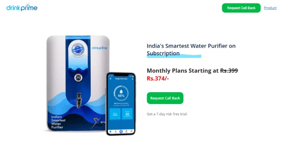
With increasing consciousness towards a healthy lifestyle, pure and safe water becomes the center of the issue. The need of every individual has to be at its best quality to serve its purpose. Founders of the DrinkPrime water purifier identified the market gap.
There was just filtered water but not healthy water delivered to everyone. DrinkPrime is called the Smart Water Purifier of India with technology-enabled controlling and measuring.
DrinkPrime was awarded the “Unique Startup” award at a Bengaluru Summit. With a monthly subscription-based model, the DrinkPrime team takes complete responsibility for a regular software upgrade for the purifier.
Within a few months of launch, the product got hundreds of users and the good quality service made it more popular among the audience.
Features of the DrinkPrime Landing Page
There were very less water purifiers digitally boosting their brand. DrinkPrime decided to delight the audience comprehensively. Landing pages are goal-oriented and give the audience a chance to go through every detail and then buy the product.
This landing page has so many sections with the objective of satisfying the audience with every piece of information they are looking for.
Embedding Video, high-quality visuals, and immersive interfaces are some of the features making this landing page better than others. Working on a minimal approach, the complete landing page is user-centric with the correct placement of CTAs at regular intervals.
1. Brand Oriented Design
Every brand has its own story to tell and the design of the landing page is the medium that expresses it for the organization. The GRAFFERSID website development team worked on the landing page keeping in mind the service offered by DrinkPrime.
That is why the landing page is highly inspired by the texture of water to maintain the brand appeal of the organization. Further, the design also has futuristic elements to present the advanced feature offered in the product of DrinkPrime.
2. Search Engine Optimisation
A popular myth in the web design industry is that a landing page doesn’t necessarily require search engine optimization. However, our dedicated developers believe otherwise.
The team paid extensive attention to various elements such as HTML syntax, heading sizes, and readability to ensure that the page meets the ranking criterion set by various search engine algorithms.
3. Video Player
Apart from text information, the audiovisual medium holds great potential to hold the attention of the visitor on the site. Keeping this in mind the developer team leveraged this opportunity to be used in assisting various sections of the landing page such as the testimonial section.
The player has a specialized slider effect to give a natural experience to the user. While doing the frontend design, the team ensured that the feature does not hinder the navigation and viewing experience of the user in any way.
4. Messenger Integration
Being an experienced website development company, we understood that the primary goal of any landing page is to convert a visitor into a lead. The easiest way to do this is to cut down the hassle when connecting to the brand.
That is why the landing page contains a static icon of the messenger app which lets the user connect with the company with just one click.
5. High-quality Graphics
To create a greater impact on the visitor, it is always necessary that high-quality graphics of the product and other elements are included in the design. The UI/UX designing team created piles of custom illustrations for the project to decide on the best one.
In the course, the team ensured that there are no performance issues due to the inclusion of graphics. Thus creating a synergy between the performance of the front end and the back end
6. Social Media Connectivity
Social media profiles act as a detailed sales pitch for the business. They show what the values of the organization are apart from offering a product. It helps in forming long-term relations with consumers and prospective clients.
Keeping this in mind, the team included various social media pages of the company on the landing page. Also, detailed attention was placed on the color and tone of the icons, so that they do not blend with the background completely.
7. Chatbot
Providing instant assistance to any query is the key to convert a visitor into a lead. Following this approach, we put up the idea of a chatbot to the organization and were given a nod after looking at the prototype.
The developers have been experienced with this component as they have worked on multiple projects with this feature. However, the UI/UX design and development team also made sure that the chatbot does not create any hindrance in the viewing experience of the user.
8. Lead Capture Form Integration
The design team studied various sites to look for the best features that can be included in the landing page. The team consulted with digital market experts regarding this and decided to include a lead capture form.
But instead of using the “in your face” method, the front-end design team placed the lead capture form specifically at a place where the visitors can notice but do not get any problems in their viewing experience.
9. Clear Call to Action
Another important conclusion that came out with our discussion with the digital marketing experts is the placement of a call to action. But first, it was important to create an attractive and interesting call to action.
This required the joint efforts of the front end, back end plus the design team to make sure both the looks and functionality of the CTA buttons are at the optimum level.
10. Security
The landing page collects important data from the users by using its lead capture forms and messenger integration. This made it crucial for the team handling back-end service to ensure the security of all the data traveling from the visitor’s computer to the server.
High-end security protocols are used to encrypt the data along with extensive testing that keeps both the company and visitors protected from any kind of cyberattacks. Further, while choosing the hosting services the team confirmed that there are constant security updates in the future.
11. Dynamic content
Being a UI/UX design company, we have always focused on constant upskilling and learning the new trends. One of such trends is the use of dynamic elements on the landing page, this can be in the form of animations or slider effects.
The main aim of this feature is to provide a seamless and interactive user experience to the user. While adding this feature, cost efficiency was also kept in mind to provide the best development services at reasonable costs as we were working for a startup.
12. Responsiveness
After the required initial research, the team gained a new perspective in their development efforts. We saw that the majority of the traffic on similar landing pages came from mobile phones and not only PCs.
The team used technologies like bootstrap while making specific changes in the look and feel of the landing page to make it compatible with devices with varying sizes. This was also confirmed later in the testing stage to ensure that the user gets the same experience even while seeing the landing page on different devices.
13. Consistent Color Tones
The design team at GRAFFERSID has extensive expertise in the concept of the psychology of colors. A simple color tone can highly affect the decisions of the visitors.
After carrying out detailed talk sessions with the company to understand their requirements, the team created unique color pallets and took the opinions of people to give the best tonal look to the landing page.
14. Navigation Assistance
The team integrated a parallax scrolling model into the website to give it a further visual appeal. However, it was important that the user does not get any problems in constantly scrolling up and down on the landing page.
That is why the front-end team included a simple but handy static navigation assistant. This button can take the user directly at the top or the bottom of the page from any place on the website.
15. Clean and Simple Code
When creating any digital product job such as custom mobile app development or web development, the GRAFFERSID team also keeps into account the future maintenance of the particular product. This requires a clean, simple, and well-commented code to begin with.
We used our long-established coding protocol that ensures a product with minimum code and maximum functionality. If in any case there is a requirement of upgradations in the future, this approach makes it easy for any developer working on the landing page to make any changes.
16. Cross-Browser Compatibility
Just like the landing page can be accessed through different devices, the same users can use different browsers to see a website. Every browser has some different rules regarding the display of the website, thus the landing page must look equally good no matter which browser is used.
That is why, in the process of development and testing, the developers did comprehensive cross-browser compatibility tests to guarantee smooth functioning.
17. Interactive Animation
Most of the content on a website or landing page is static, but a little addition of animation can have a long-lasting impression of the brand on the minds of the user.
Using animation technologies, the team includes effects in places like the startup page, to keep the users engaged while the landing page boots up. Additionally, similar effects are included in the sidebar navigation to give the landing page a greater aesthetic appeal.
18. Extensive A/B Testing
Companies hire dedicated developers to make sure that the end product is packed with maximum functionalities. But at the same time, it is important to pay attention to whether the landing page or app can work in extreme conditions.
The GRAFFERSID team performed elaborate A/B testing on all the features of the landing page to warrant a smooth operation without any bugs.
What did the Client say about the collaboration with GRAFFERSID?
We were looking for some good web development company in India for ensuring that the landing page is also converting the people. GRAFFERSID has a separate process for the Startups and their understanding of our requirement was amazing.
I would highly recommend the team of GRAFFERSID for all companies looking for digital transformation.


