About the Client
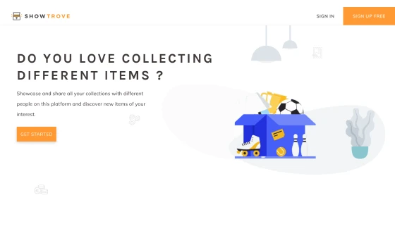
Show Trove unlike any other social media platform is a unique approach to connect collectors worldwide and share their collections. This becomes even more important with the advent of technologies like NFT. Additionally, Show Trove provides a legit means for collectors to deal and check out collections nearby for purchase.
The founders of Show Trove wanted a site that had optimum interactivity to keep the users constantly engaged with the platform.
There hasn’t been an idea like Show Trove until now and it was important that its originality was secured. With its inception, the site has already proved to be a boon for the collector community.
Within months of its launch, the site has seen a huge expansion in the growth of its traffic with a multifold increase in the registered users. The content-focused design has made it the center of attraction for both collectors and non-collectors.
With deep research and execution, GRAFFERSID has helped Show Trove to become one of the favorite spots for item collectors on the Internet.
Features of Show Trove Website
Having prior experience in designing social media websites, the GRAFFERSID team was well aware of the details and was well prepared. However, the idea behind the Showtrove website was unique and catered to a very specific niche audience.
Keeping this in mind the team conducted extensive research sessions regarding collectibles and people interested in them. After getting the exact idea about the thought process of the potential users, the team began its work on the features.
1. Consistent Design
To reconcile the overall brand marketing with the theme of the website, the website development team at GRAFFERSID prototyped the initial designs to be consistent.
This was ensured with equal efforts by the design team by ensuring optimized color usage for various elements on the website. Further, while researching the team also took into account design usage on social media handles of the company and the preferences of the user base.
2. High-Quality Graphics
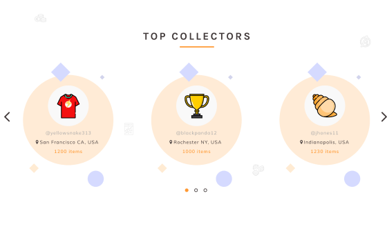
In modern web designs, there is high usage of graphics and illustrations along with the text. This is particularly to target the psychology of the user.
According to various researches, an average user tends to remember more from a graphic than written text information. Thus the team has used high-quality graphics and illustrations and also gave the option to users to upload photos from their own devices.
3. Registration and Login
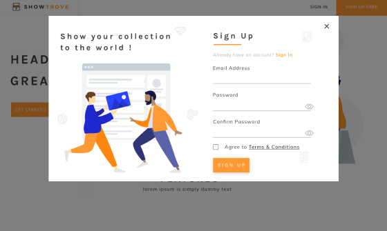
As a website development company, GRAFFERSID has worked on registration and login features for innumerable clients. However, the front end of the registration and login panel differs from project to project.
The development team has integrated the website with a registration and login dashboard that remains consistent with the overall design of the website. Also, the backend team has ensured that the information submitted by the user is stored properly and is secure.
4. Profile and Category
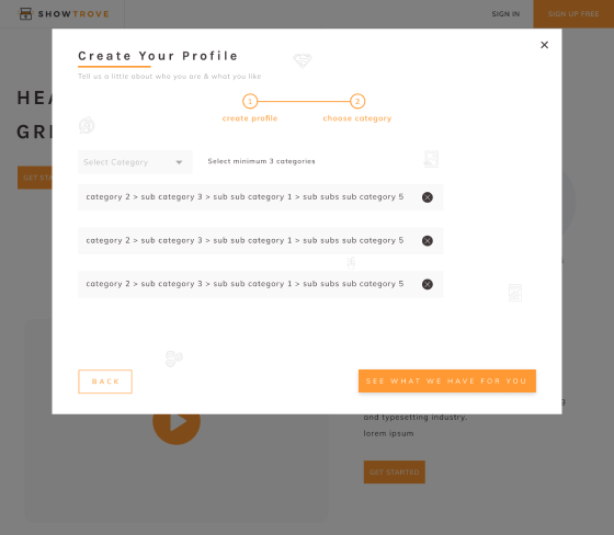
The Show Trove website is created as a social media platform for people who love to build collections. Hence it was logical that every user had their own personal profile to represent them on the website.
The development team conducted extensive research sessions to incorporate necessary and unique features into the profile section. Further, the profile feature provides the option to the users to create categories of their collections to maintain homogeneity.
5. Notification and Alerts
Being a social media site, it is obvious that the website needs a swift notification and alert system for its users. This lets them know newer developments that take place on the website with minimum delay.
The backend development team has optimized the underlying code to ensure that the speed of the website remains at optimum. While the frontend team has given custom effects and sounds to notifications to bring in the originality factor.
6. Collection Search Bar
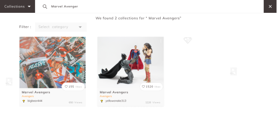
With a large stash of collections sitting on the website, it is almost impossible for a user to search for their favorite collections manually. That is why the site is laced with a quick search bar which allows the users to search for collection.
What makes the search function even more special is the filter system integrated with the search system that gives a personalized touch to the feature.
7. Likes and Views
Interactivity is a major requirement when it comes to websites focusing on bringing the users back regularly. That is why the website contains the feature that allows the users to like a particular photo or video from a collection.
In the UI/UX designing process, the team has ensured that the feature is simplistic and that is why it just requires a double click to like a post. Further, the views dashboard allows the user to see the total likes and views on the posts to get better insights.
8. Membership Plans
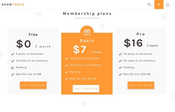
The financial viability of a project is a top priority for any establishment before starting the work. Mostly this is done through either an advertising model or subscription model. The Show Trove website has both of them to provide flexibility to the user.
This means that the users who are serious collectors and want the advanced features can take the subscription. On the other hand, normal users can keep using the website freely by allowing minimal ads on the timeline.
9. Navigation Bar
Whether it’s a normal landing page or a full-fledged interactive website like Show Trove, a navigation bar is important for both. However, as the scale of the project increases, it requires a more advanced navigation bar.
As a UI/UX design company, GRAFFERSID has developers that have ample experience with this feature. The backend team has created a proper link of the website elements to the navigation bar which allows the user to travel from one part of the website to another in an instant.
10. Rankings and Scores
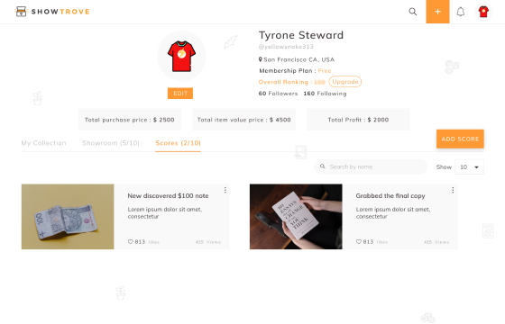
To stand out among tons of other websites available on the Internet, it is always necessary for a site to have some unique features. Adhering to this principle, the development team came up with the ranking and score feature.
This allows the site to assign a score to the users based on the likes and interactions. Based on which each user is given a rank in each category.
This is possible with the help of the custom algorithm created by the development team which takes care of all the calculations.
11. Item Description
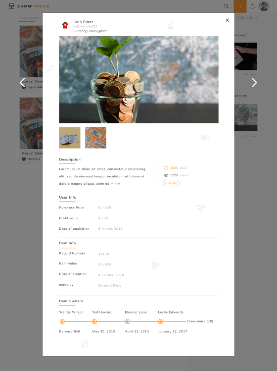
To help the user in gaining more information about a collection item, the website has a special item description feature. Through this, the user can hover over the image of an item and click on the description popup which takes them to the description page.
Although, if the description isn’t available, the feature also allows the user to check out related information regarding the item on the web.
12. Chat
To further enhance the interactivity quotient of the website, it was necessary the users can connect one to one. Hence the site contains a chat module that allows instant messaging and sharing of audio, video, and document files.
Also, the chat module contains an option through which the user can share the link to their collection within the chat and see a preview with a hover over the message.
13. Cloud Space
The dedicated developers at GRAFFERSID always kept the performance as their top priority over everything. The site required that the users are given ample space to upload and download their data.
Thus the development team provided a solution for this through cloud integration, especially the backend team worked on creating efficient data structures which allowed the swift performance of the website.
14. Showroom Dashboard
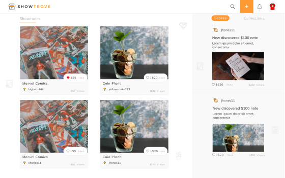
As the name suggests, the showroom dashboard allows the profile holder to create a virtual showroom for their collections. This consists of micro features regarding privacy as to who can see the collections.
The UI/UX design and development team has used a modular setting to arrange the collection folder which provides a clean look for the website.
15. Responsiveness
For website development in current times, responsiveness is a fundamental feature. Today a large part of Internet surfers use phones to access websites.
To ensure that the website performs equally well on all the devices with different screen sizes and operating systems, the development team has used technologies like Bootstrap and also leveraged its previous mobile app development experience. Besides, there is an ample amount of testing done to weed out any shortcomings.
16. Auto recommendation
Keeping the users constantly engaged with the site requires they are supplied quality and personalized content at regular intervals. With the help of the custom algorithm developed by the team, the site can make auto recommendations to users regarding content and people to follow.
The algorithm simply records and analyses the previous behavior of the user on the website and uses the conclusions to make the recommendations.
17. Scrollable feed
As a social media website feed is an important part of the structure of the website. The development team at GRAFFERSID has leveraged a long scrolling method for this.
It allows the users to scroll continuously helping to keep them engaged with the website constantly. Further, it also adds to the responsiveness as the feature also works well in smartphones.
18. Bookmark and Reshare
A user can come across many posts on the site that they like. However, it is always difficult to remember them for later. To fill this gap, the site has a bookmark feature that allows the users to save posts they like.
Additionally, the users can see these posts on a separate bookmarks dashboard where they are arranged date-wise. Also to boost the connectivity of the website with other platforms, every post has a reshare button that lets the user share the post on other social media platforms.
19. Privacy Controls
Privacy and safety are major concerns for a user when they join a platform. That is why the developers have given adequate privacy controls to users. Here they can choose people who can see their profile and posts.
Further, the chat feature contains a smart spam filter that weeds out messages from suspicious accounts and puts them in a separate folder to make the user experience safer.
What did the Client say about Collaboration with GRAFFERSID?
GRAFFERSID has performed above all the expectations to deliver a website that is exceptional on a scale of performance. Maintaining a constant communication channel, the GRAFFERSID team has fulfilled their commitment well before time and with the utmost quality of work.
