About the Client:
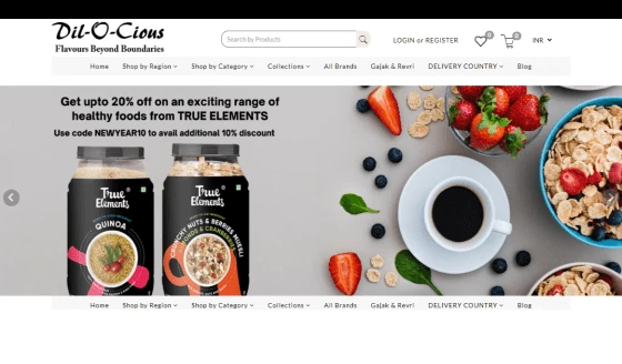
There have been a lot of different types of e-commerce websites in the Food industry but Dilocious is different. Combining the variety of types of orders, Delicious is an amalgamation of various ideas resulting in an online mega food ordering website. Yes, breaking every type of order in the online food delivery business, Delicious delivers all over India from all over the India shops.
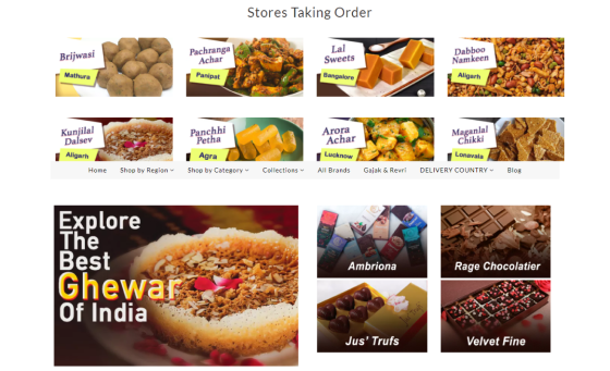
Basically, the idea behind this startup is to make profiling of the top famous food cities of India. People visit numerous places during vacations and they remember the tasty food of that place. Unlike others, Dilocious tracks the authentic source of famous food and lists them on the website. From Jammu to Kerala, every famous food place is listed on this website.
With such a unique idea, a Dilocious website has the challenge of getting a UI/UX, which is simple and still efficient.
Features of the Dilocious Website
There were plenty of features to tell users about. Every feature required user attention and was nowhere seen in the digital landscape. Therefore, creating such a website that is functional and minimal at the same time was a challenge for the team of GRAFFERSID. With the application of design concepts and putting the user in the center of the process, we were able to create a website that met the expectations of the users. During the beta testing, further improvements were performed.
Seamless Registration and Login
The foremost thing a new user encounters in an e-commerce website when looking to make a purchase is its registration and login page. Plus the transition from just a visitor to a user must be completely smooth. Hence the website development team at GRAFFERSID integrated the registration system with social media and Google login. This helps the user to register and login themselves with just a few clicks.
Search Bar with Filters
Presenting a large range of products from all over the country, the site hosts a big diversity in its offerings. Yet if the user can’t find these products, the whole setup remains of no use. Ensuring that this doesn’t happen, the site has a dedicated search system along with a filter. This filter lets the users narrow down their searches on important points like price, availability and much more. Due to this the whole timeline of a user identifying a product and making a purchase becomes much shorter than usual.
Mobile Application Integration
As a mobile app development company, GRAFFERSID has already worked on projects that require proper connectivity between the business website and applications. This was also required in the Dilocious website, where the mobile app development team collaborated with the development team to create a seamless integration. Through this, any change made by the user within the application is reflected in the website and also similar results in the opposite case.
Navigation Bar with Dropdown Menu
In the Search Engine Optimization basics, the most important aspect of a website is its navigational ease. A site having navigational ease is much easier to be scrolled by the search engine bots. But the real advantage of proper navigation is a better user experience. The site has a custom navigation bar that comes with a hover enabled drop-down menu. Using this the user can see all the available options in various categories without clicking anything.
Shop by Categories
Having a dense placement of elements can confuse the user and give a site a cluttered look. This is absolutely against the modern web design principles which focus on keeping the UI as clean as possible. Hence the shop by categories section becomes a great organizer. Here the user can find all the categories and subcategories of a product and brand in neatly organized sections.
Site Caching
To help the site to function at its maximum, the development team has employed various efficiency-enhancing features. One of the most important among them is the site caching feature. The function helps the backend server to store important files in the RAM of the system for faster accessibility when required by the users.
Personal Wishlist and Shopping Cart
Forgetting what you wanted to buy is pretty common both in reality and online. Fully understanding this problem, the UI UX designing process included features that can help the user track things they want to buy in future. Hence the Wishlist feature, allows the user to save products they see and want to refer to in future. On the other hand, the shopping cart allows the user to place all their purchases in one place for checkout. This makes the cost calculation and discount application much easier.
My Wallet
With time every technology has gone through further improvements and the same is true with payments technology. Unlike in the past, now a user doesn’t need to go to a payment gateway constantly for making payments. With its wallet function, the site allows the user to keep a sum in their digital wallet on the site. From here the user can make instant payments without having to go through the digital banking processes. Also, the dedicated developers have made sure that these payments are completely safe through end to end encryption.
Map Integration
The client business gives the users a facility to purchase their favorite sweets and snacks directly from famous local producers. From the consumers perspective, they must know the exact place from where they are making the purchase. The map API used in the site lets the users pinpoint the seller’s location. Besides, the map feature greatly assists another important feature which is delivery tracking.
Delivery Tracker
One of the most demanded features in e-commerce websites currently is delivery tracking. This assists both the sellers and buyers in tracking their goods. Further, the client can also keep an eye on the movements of the orders and make sure that all of them reach on time. With special insights from the custom app development team, the site has a delivery tracker which constantly notifies all the involved parties about the order movement with the help of a geolocation module and map API.
High-quality Graphics and Illustrations
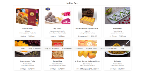
A quality graphic can communicate what a thousand words might fail to. In modern web design, an immense focus is placed on using quality graphics and illustrations. The UI UX design and development team has used graphics that enhance the craving for the products while giving them enough information. Further, the custom illustrations created by the design team have helped the site to maintain a unique look.
Cards based UI
The arrangement of elements of a web page is a crucial aspect of the overall web design. The placement of elements not only depends on the visual aspects but also the brand approach. The design team has used a card-based UI for the site which arranges graphics and reviews in form of cards. The particular design gives a sense of arrangement and clarity giving navigational ease to the user.
Auto Recommendation
What can be better than presenting the users with a product they have high chances of purchasing. The algorithm designed for Dilocious by the GRAFFERSID team makes it possible for the site to make recommendations to the users. These recommendations are generated based on the previous user activity and purchases of the users. Still, the users have the option to make changes to the auto recommendation settings to make them more personalised.
Hover and Micro animation effects
Animation effects have been an important part of web design and web development from the past. However, the tools and techniques of it have become much more refined today. The design team has used these tools and techniques to equip the site with engaging animations. Especially the hover and scroll-triggered effects make the site look alive and more interactive to the new user.
Testimonial Slides
The reviews by existing users help a brand to establish a reputation in the initial growth stage and further. Hence the presentation of these testimonials becomes equally important on the site. To use the space on the site more efficiently, the development team has used a slider. The feature makes the reviews scrollable horizontally and changeable automatically. New users can find these testimonials on the home page for easy reference.
Responsiveness
Today the diversity in devices we use to access the Internet is expanding rapidly, these range from phones, tablets and PCs. Thus the importance of responsiveness increases multifold especially for a site that experiences high traffic from mobile devices. The development team at GRAFFERSID has used technologies like Bootstrap which make the site adaptable to different devices while maintaining the same performance.
Cross-Browser Compatibility
Similar to different devices that are used to access a website, it is normal that the site will receive users who access the site from different browsers. Though most browsers display web pages similarly, a few elements can be displayed differently due to the varying protocols among browsers. To counter this the development team conducted extensive testing sessions to make sure that there are no display differences.
Social Media Connectivity
Social media is an unskippable part of a sound digital marketing strategy for any business today. In the case of an e-commerce website, social media connectivity becomes almost mandatory. The development team has ensured this for the Dilocious site by connecting it with various social media pages and handles of the company through icon links at the footer of the website.
Ratings and Review
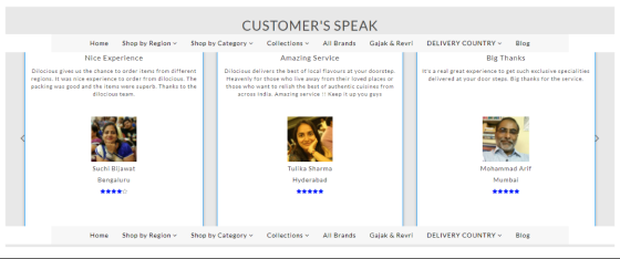
Being an e-commerce website, the site needs to maintain standards of quality on the platform to retain users for the future. This becomes possible with the availability of dedicated ratings and review systems. Through this, the existing buyers can rate their purchases and sellers with numerical ratings. Besides, the team with its algorithm has ensured that false reviews are detected at the earliest and removed.
What did the client say about collaboration with GRAFFERSID?
Deciding to work with GRAFFERSID for our unique ideas has been the best decision we took. During the website development process, we realized the technicalities that affected the user experience and the knowledge of team GRAFFERSID is incredible. The development was result-oriented and took care of every interface until the user reaches the final destination.
