About the Client
As the name sounds, Managing Across Asia is a company enabling businesses to become a successful multinational brand with sustainable infrastructure and business model. Often there are instances when a successful business of a country struggles in making basic profits when they globalize themselves. Looking for this problem after working with MNCs for more than 15 years, Founder Gordon started helping businesses with his experience and strategies.
To expand the service area for a complete Asia-specific region, Gordon decided to go digital. To represent his idea of becoming a corporate giant across multiple countries, our team covered a lot of areas of user experience to develop a website that can help everyone. Catering to more than 10 different types of Industries, Managing across Asia gained significant traffic and clients in the first quarter itself.
With simple UI/UX and goal-oriented design of the landing pages, the conversion rate kept increasing over time. As of now, Managing Across Asia has won 5+ awards for their service in the field and also an award for unique and minimalistic UI/UX design of the interfaces.
Features of the Managing Across Asia Website
Along with a business consultant, Gordon is also a writer. His approach to educating the visitors was reflected in the final design of the website. Understanding the client’s requirement is a custom and mandatory step at GRAFFERSID which ensures that goals are aligned. Top Features of the Managing Across Asia website are incredibly targeted CTAs, direct order the book option, book a consultation call in no time, and many others.
Long Scroll Model
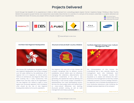
Catering to its content-heavy infrastructure, the site uses a long scroll model to give a better viewing experience to the user. GRAFFERSID: Web and Mobile App development team has ensured that despite having the majority of content in the textual form, the site can maintain proper readability and structure. The long scroll model helps to fit this content while giving a clean look to the website..
High-Quality Graphics
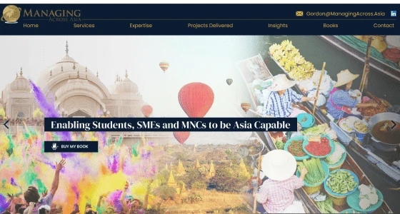
The attention-capturing capabilities of good graphics can never be overstated. As the website serves visitors who are interested in Asia, the graphics are completely focused on various countries in Asia. Further, it is also ensured by the graphic team that there are no copyright issues in the future by incorporating original purchased and free images for the website. Also, images are well balanced in their size and quality to keep the site quick in its operation.
Navigation Bar
An efficient navigation system serves two purposes for a website, first, it makes it easy for the user to find their required content. Second, when it comes to search engine optimization, a good navigational structure helps the search engines to index the site quickly without any issues. Thus the UI UX designing process has greatly emphasized keeping all the necessary links on the navigation bar. This helps the users to access all the important sections of a website from one place.
Dynamic Slider
Having a completely static website is a thing of the past now. To give the site more capabilities, the upper fold of the website contains a dynamic slider. Displaying different CTAs at small time intervals, these slides help in lead generation by presenting the business proposals. While at the same time, these slides play a great role in saving space on the page. The backend team has further modified its performance so that it does not affect the performance of the site in any way.
Attractive Typography
As mentioned earlier, the majority of content on the website is in form of text, thus the site required a great readability environment for the user. The typography of the page is chosen based on the theme and business goals of the website to keep it professional. Also, the size of the text and its coloring is chosen to ensure that there is a balance between the graphic and textual content.
Custom Icons
The UI/UX design and development team instead of choosing premade generic icons for the website, they have used custom created icons. These icons are made compatible with the hover effect feature of the website to make them dynamic. Helping ideas to be presented more interestingly, these icons have been thoroughly tested to ensure that their display quality remains consistent despite the type of device or browser used to access the site.
Optimum CTA Placement
The call to action is one of the crucial components of a sound digital marketing strategy for any business. To make sure that the client website can leverage this, the dedicated remote developers at GRAFFERSID had consultations for the CTA placements. The CTAs are usually presented in the form of buttons to take actions that the client needs. With the placement, special attention has also been paid to the design of these buttons to make them stand out.
Consistent Design Theme
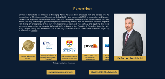
The site uses two different color combinations to represent contrasting ideas on the site and separate different sections. Using the principles of color psychology, the design team has kept the theme consistent without using too many variations. As the client website focuses on a more professional approach, thus this color combination matches well with their business goals. Further, the color combination also assists the viewing experience of the user whether it’s being surfed in the daytime night.
Intra-Site Linking
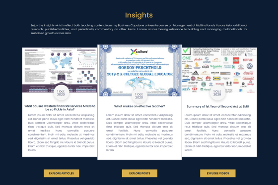
As a website development company, the responsibility of GRAFFERSID extends beyond just the technical aspect. The focus on concepts like SEO is equally important to ensure a complete product. The intra-site linking helps in forming proper connections between various sections of the website as well as improving its SEO rankings. This becomes possible as the crawler bots of the search engine find it easy to map the complete website.
Speed
The loading speed of a website page is important for both capturing user attention and ensuring better search engine rankings. Thus the development team included technologies like site caching to reduce the load on the servers. While the efficient back-end code of the website makes sure that each function takes the shortest time to complete. Further, the optimization of graphics has also been a top priority to balance the performance and visual aspects.
Responsiveness
The modern Internet infrastructure is more focused on compact devices, unlike the older times. As a UI/UX design and development company, GRAFFERSID has vast experience in creating responsive sites. By using technologies like Bootstrap, the site is completely adaptable to devices with different screen sizes. The elements on the page are also placed while keeping in mind their look on different devices. Also, the color display on the website remains consistent on screens with different quality.
Clean Code
In addition to creating a site, it is also important to consider the further developments and maintenance of the website. Any new addition to the website requires that there is a clean and well-structured code that is also well commented. As an established procedure, the development team at GRAFFERSID follows strict guidelines related to the structure and commenting of code. Further, the existing code has also been optimized to make it lighter without compromising on the performance.
Lead Generation Form Integration
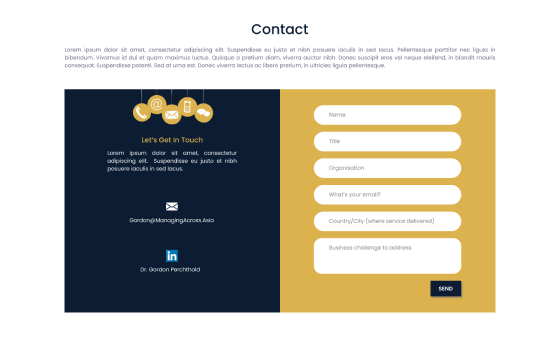
To aid the lead generation of the client, the site has been integrated with a popular lead generation resource as a form. As the user surfs the website, the form is displayed after a few minutes. The form asks for the contact details of the visitor to have a detailed discussion. While it also has an autofill up option that can take the necessary information from the google account of the user if given permission.
Social Media Connectivity
There are no two opinions about the importance of social media in boosting the digital marketing strategy of a business. Hence the website is integrated with all the necessary tools to assist the visitor in accessing the social media accounts of the client. Also, the analytics tool within the website keeps the data of the users who have come from a social media link. This has greatly helped the client in checking the efficiency of their social media strategy.
Browser Compatibility
Keeping the site accessible to everyone, the development team has paid optimum attention to the browser compatibility aspect of the website. With thorough testing of the website in different environments and browsers, the development team has ensured that the site works flawlessly in all the popular browsers. Further, the display aspect has also been modified to keep the display of elements similar in all the browsers.
Site Caching
Along with the front end, the performance of a website has more to do with its backend. Especially the servers side logic, using the site caching technique the developers have enabled the servers to hold important data in the RAM. This allows the servers to respond quickly to common queries without creating excessive load. Due to this the site can handle a larger amount of data and handle denser web traffic without having any effect on its speed.
Hover Effects
The hover effects are an important part of the visual aspect of the website. This allows the cursor to act more than just a pointer, thus increasing the interaction with the page. With hover effects, the user can point the cursor on any link and see effects like color change and micro animations. All this adds to the overall aesthetic appeal of the website making it more interesting for the user.
Security
As the client deals with business corporations, the site handles critical data relating to business transactions. The security of this data was a top priority for the development team. Using industry-standard encryption technology like HTTPS, the site is fully protected from cyber attacks. All the data traveling between the servers and the website remains completely encrypted.
Google Analytics Integration
Having an analytical insight into the user behavior on the website is a great advantage for taking future decisions. The Google analytics program allows the client to gather important statistical insights into aspects like location and bounce rate. Using this data, the site may be further improved in the future to meet the user demands more closely.
What did the Client say about Collaboration with GRAFFERSID?
GRAFFERSID has understood my requirements pretty well. They have got the right industry experience, and my work was done within the timeline. From communication to project delivery, everything was smooth. I really liked the overall experience of working with the team GRAFFERSID.
Done in collaboration with our partners at mobile and web solutions https://mobileandwebsolutions.com/
