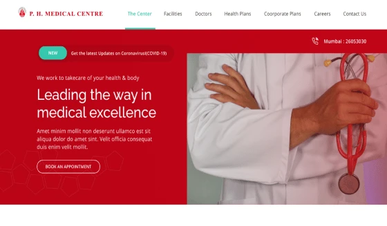
About the Client
P.H. Medical Center is a one-stop solution for quick, modern, and world-class services in the healthcare Industry. PH Centre has been serving patients for the last 10 years and now wanted to digitize their presence and spread help to people everywhere.
The unique idea was to promote Healthcare tourism and attract people of fellow countries. P.H. Medical center is recognized by the Government of India for its work in the medical field and helping needy persons with affordable and high-quality treatment.
P.H. Center was awarded for its exceptional services in identifying dangerous chronic situations in the early stages. With so many awards and badges as a reputed and trusted hospital, PH Medical centre wanted to reflect its legacy in the digital world also.
At GRAFFERSID, our team has expertise in working with dominating brands in the market. Our successful previous experience helped us understand the requirements and craft another magnificent digital presence for P.H. Medical Center.
Features of the PH Medical Centre Landing Page
We started the work with intensive research and discussions with stakeholders to clarify the requirements. The work was mostly in the front-end part and that required expertise in UI/UX design and development.
GRAFFERSID has crafted User Interfaces that have attracted fundings in the bootstrapping phase itself.
1. Long Scrolling
Following the latest trend concerning landing page scrolling methods, the PH Medical Centre Landing Page works on a long scrolling model. This lets the user see every element on the same page one by one.
Further, the UI/UX design and development team has used the long scroll feature to create a storytelling effect on the landing page to capture the visitor’s attention almost instantly.
2. Clean UI
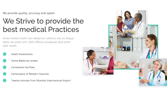
User experience is the topmost priority for the website development team at GRAFFERSID and a large portion of user experience comes from a clean layout and well-organized content.
Thus the developers paid due attention to the placement of various elements on the page and while doing this it was also kept in mind that there should be sufficient whitespace.
However while doing this, the design team ensured that there is no compromise with the quality of content and graphics on the page.
3. Navigation Bar
The navigation factor is a crucial one when it comes to the search engine rankings of a particular webpage. The search engine bots prefer the sites where the users can easily go through the information.
Keeping this in mind the UI/UX designing process included the creation of a simple yet effective navigation bar. This helps the user in visiting a particular section of a page instantly with the click of a button.
4. Consistent Color Design
As a UI/UX design company, the single most important factor that is focused on our development process majorly is the usage of colors. This is because colors help form an image of the brand in the minds of the visitors.
Hence by using the concepts of color psychology the team has used colors that are consistent with the value proposition of the client. The landing page uses a dual-color design to highlight different elements on the page.
5. CTA Placement
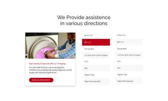
The main focus of any website or landing page is the attraction of new visitors and then converting them into leads and further into clients. However, the element that makes this possible is the call to action.
As a result, the frontend design team has leveraged their experience with website and mobile app development to choose the most optimum position for the CTA buttons.
Additionally, the UI team has ensured that the buttons stand out with unique design and color-coding.
6. High-Quality Graphics
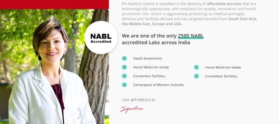
Good graphics speak a thousand words without saying anything and this is proven through research that suggests that an average person remembers more from a photo than a text.
Using this possibility the design team at GRAFFERSID has ensured that the site presents graphics that speak to its visitors.
Also, the team has ensured that the photos aren’t generic or stock but of actual real people. This helps the visitors to form an even stronger connection with the brand.
7. Plugins
While working as a website development company, our team has the experience to identify the areas where a website needs custom features and auto features. Thus the developers have identified areas where already available plugins will come in very handy.
These plugins range from solutions that provide analytical assistance to visual improvements to the landing page. Further, it is also kept in mind that there is utmost coordination between all these plugin systems to provide a seamless experience to the visitors.
8. Responsiveness
While working on the numerous features for the landing page a big challenge for the team was maintaining the responsiveness of the page.
However, with all the working experience from the previous website and custom mobile app development projects, the developers were able to surpass this hurdle.
Using technologies like bootstrap and various javascript frameworks, the team ensured that the website is flexible and adaptable to devices with different screen sizes and operating systems.
9. Security
As the page receives important information from the user through its lead generation process, it becomes crucial that this information is secure from hackers and malware.
Hence the dedicated developers at GRAFFERSID have ensured this safety by using high-level security standards like HTTPS.
This also ensures that information travelling between the servers and the page is completely encrypted and can only be accessed by the authorized person.
10. Maps and Geolocation
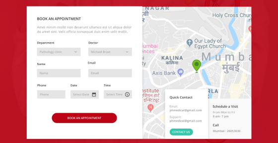
To help the client business to form a stronger local identification, the team has used the geolocation feature which comes with a map setup.
This helps the visitor to find the most suitable route to the hospital. Besides this feature also helps in assisting the client with their SEO strategy.
Making it easier for the search engine to list the establishment whenever a user searches for a medical establishment near them.
11. Modular Setting
The presence of multiple sections on a page requires the content to be placed in a layout that keeps the user experience at optimum.
Among various other available options, the design team chose the modular setting of content to give a more open and clean look to the landing page.
This also helps the user to navigate among all the content on the page freely without any other elements coming in the way while navigating.
12. Clean Code
It is often seen that in the pursuit of a good-looking landing page, the cleanliness and formatting of the underlying code are often overlooked by a lot of developers. However, at GRAFFERSID, it is our topmost priority to maintain both the outer and inner quality of the product we create.
Hence the developers have followed the common protocols that developers use while coding. Also, there is an ample amount of commenting wherever needed to facilitate any future improvements.
13. Dynamic Testimonials
To amplify the credibility factor of the client establishment, the usage of reviews and testimonials of people who have previously availed service is a must.
To make this presentation more effective and interactive, the developers have created a dynamic testimonial dashboard with a slider effect.
This makes the testimonials change automatically after a predetermined interval which helps the page to grab user attention.
14. Search Engine Optimisation
Contrary to popular opinion we consider that even a landing page should be properly optimized for search engine rankings. This can come in handy when a visitor searches for services related to the client establishment.
This is done by following the guidelines issued by popular search engines like Google and Bing. Further, the team has also consulted SEO experts to make further improvements to ensure higher rankings for the landing page.
15. Social Media Integration
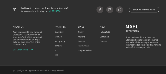
In a socially connected world such as ours, the digital presence of a business must be completely interconnected. With this idea, the designers and developers have worked on the integration of the landing page with the social media pages of the client.
To make this a reality the design team has used custom-designed icons while the frontend developers have worked on the placement and proper functionality.
This makes it easy for the visitors to reach the social media pages of the client with just a click or come to the landing page from the same social media pages.
16. Animation and Hover Effects
Interactivity is a big plus point when it comes to standing out among the competition but at the same time, it also comes with the problem of functionality problems.
That is why both the front-end and back-end team have worked in complete coordination to include animation and hover effects that look good as well as don’t affect the performance of the page.
17. Google Analytics
While managing a landing page, it becomes important that the owner of the page can quantify the performance of the landing page. This requires data relating to the landing page and various visitors using it, also it becomes more helpful when you can even know the user behavior.
To make this possible the landing page is integrated with the popular tool called Google Analytics. This shows a graphical representation of data to provide new insights and ideas to make further improvements.
18. Cross-Browser Compatibility
While creating an effective landing page, it is also crucial for a developer to consider the cross-browser compatibility of the end product.
This means that even if the landing page is accessed through a different browser its visual appearance remains the same.
Hence the development team has done extensive testing of the landing page on all the popular browsers while making necessary changes on the go to churn out a completely consistent landing page.
What did the Client say about Collaboration with GRAFFERSID?
Working with GRAFFERSID has been an absolute pleasure. Their dedication to work is amazing and different from others. We loved their communication style and on-time delivery.
When deadlines are strict, GRAFFERSID is able to be flexible and understand the circumstances. We are very happy with the website and landing pages, our customers have given great reviews.
Thanks for helping us and we highly recommend them for anyone looking to actually build a brand.
