What is essential for the survival of designers in the ever-evolving scenario of UX and UI? If you take a look at the digital world, everything is transient owing to the new trends that sprout every day from both the user and competitor’s end. Designers need to stay relevant to the latest trends, be it minimalism, dark mode, 3D elements, voice user interface, bold fonts, or combined graphics along with real images. Later on, these trends form the basis of core principles and psychology of UX and UI designs.
In this blog, we will discuss a few psychological principles of UX/UI designs that will help you create a stunning user experience through amazing UX/UI designs. It will make your brand identity stand out from the rest. But, before moving to the basic principles, let’s move ahead with the aesthetic-usability effect on the UX/UI of your website.
So, let’s begin!
Aesthetic-Usability Effect
Have you been to a website that lacks direction?
Feels frustrating, right?
Now, compare a website where you know what to do exactly after having just a glimpse of it. The key lies in the intuitive design of the website, where the user can focus on the task at hand without having to compromise on functionality and aesthetics. This is what makes the user interface easy, comprehensive, and functional which eventually enhances the user experience.
Designers need to create a balance between the functionality and aesthetics of the website design. And, this is where social, behavioral, and cognitive psychology comes to play. All these factors influence a user’s decision, where aesthetics comes secondary, and an intuitive design is what users look for.
If you don’t want users to abandon your website, then consider the aesthetic-usability effect. Other than this, a few psychological principles are affecting the UX/UI that you must consider for a better ROI.
So, let’s quickly jump onto it.
5 Psychological Principles that You Need to Consider for Design
Psychology of Choice

We make countless choices each day, some are easy and some are tough. The more choices we deal with the more it takes longer for us to make a decision. Moreover, we feel more fatigued when it comes to making choices. This specific system of more choices is called Hick’s Law that states the more options you are offered, the more it is challenging to arrive at a decision.
When you are trying to create an intuitive design to help your users achieve their goals, speed is important. Here Hick’s Law helps you achieve that speed by providing fewer options so that the end-user doesn’t get frustrated and waste time selecting from a pile of options.
Prioritize the key elements of the design and keep the choices limited. Also, make sure that you break down the complex process into simple steps. Create menus for common in-app actions and group them in one. This grouping of common functions will help eliminate unnecessary elements and keep them simple. It will reduce the time to arrive at a decision helping the users to achieve their goal faster.
Keep All Interactable Elements in Reach
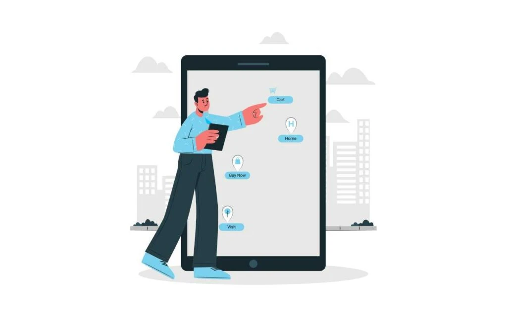
You might have seen that the farther your thumb is from the mouse, the longer it takes for you to interact with the element you want. This specific concept relates to Fitts’ Law which focuses on distance and emphasizes keeping the important elements of the website in close reach of the users. And, yes it’s a fundamental principle of comprehensive and intuitive UI design, which all users prefer.
Make sure that every interactable element that you have on your website should be big enough so users can easily spot it and select it without wasting time. If we talk about the ideal size of the elements then they should be between 42 and 72 pixels wide. It will help you hit the target because it is easy to spot which will catch the user’s attention and they will click on it even if the cursor is slightly away.
Fitts’ Law advocates the use of reachability heatmaps in the super-sized screen era, which is essential for an intuitive UI/UX design. It ensures that the crucial elements of the website are within easy reach of the users and that common actions can be taken instantly. This ease of reachability will help users to arrive at an informed decision much faster.
Read Also: Here is the Difference between UI and UX Design
Right Positioning of the Items
If you have ever been to a store, you will observe that important and popular items are kept on display; so the users can easily spot them. Likewise, a brick-and-mortar store places crucial items on the website with impactful words. It will help your users easily recognize and memorize those powerful words.
Here are a few examples of power words that you must incorporate into your website:
- Massive
- Discount
- Big Billion
- Soaring
- Save
- Monetize
- Fast
- Hurry
- Giveaway
- Limited
- Skyrocket
- Sale Ends Soon
- Quick
- Reduce
- Profit
- Jackpot
- Free
- Last Chance
- Ultimate
- More
- Special
- Surge
- Six-Figure
When you use these words, people have an easy time recalling these words and they are encouraged to act. Use these words throughout your website content working from the top towards the end. Why are we emphasizing the position or order of the power words being used? As we discussed in the example mentioned at the beginning of this point the position where the items are placed also impacts the user’s decision.
Putting crucial items with impactful words in a significant position helps users to remember the words. Thus, it makes your website more intuitive and users more comfortable.
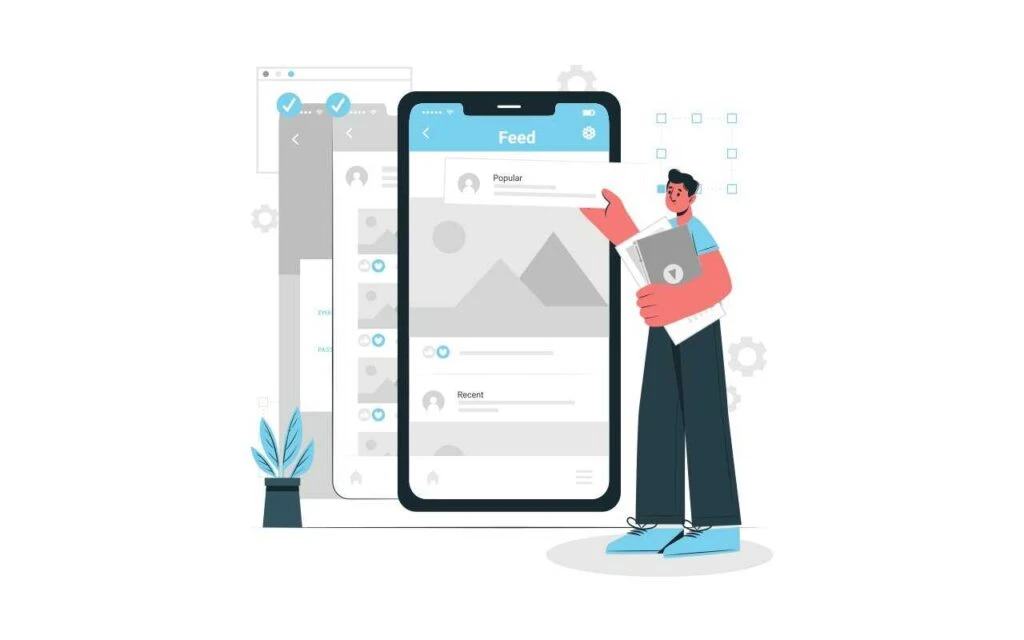
Selective Disregard to Pinpoint Crucial Aspects

We all are experienced users of products and websites and thus we learn to recognize crucial items on a website. An average user gradually understands a website and instinctively ignores irrelevant items. This specific behavior is called selective disregard, where a user stops paying attention to irrelevant items or elements and focuses on things that give it a mental stimulus.
Thus, designers must use this behavior to their advantage and get the users to hit on important aspects at lightning-fast speed. We recommend you to use every element keeping the user’s expectation in mind. Think what could be the most necessary thing for a user because until and unless anything is not necessary the user’s mind will automatically filter irrelevant information. Thus, always design with selective disregard.
Stop Tricking Users
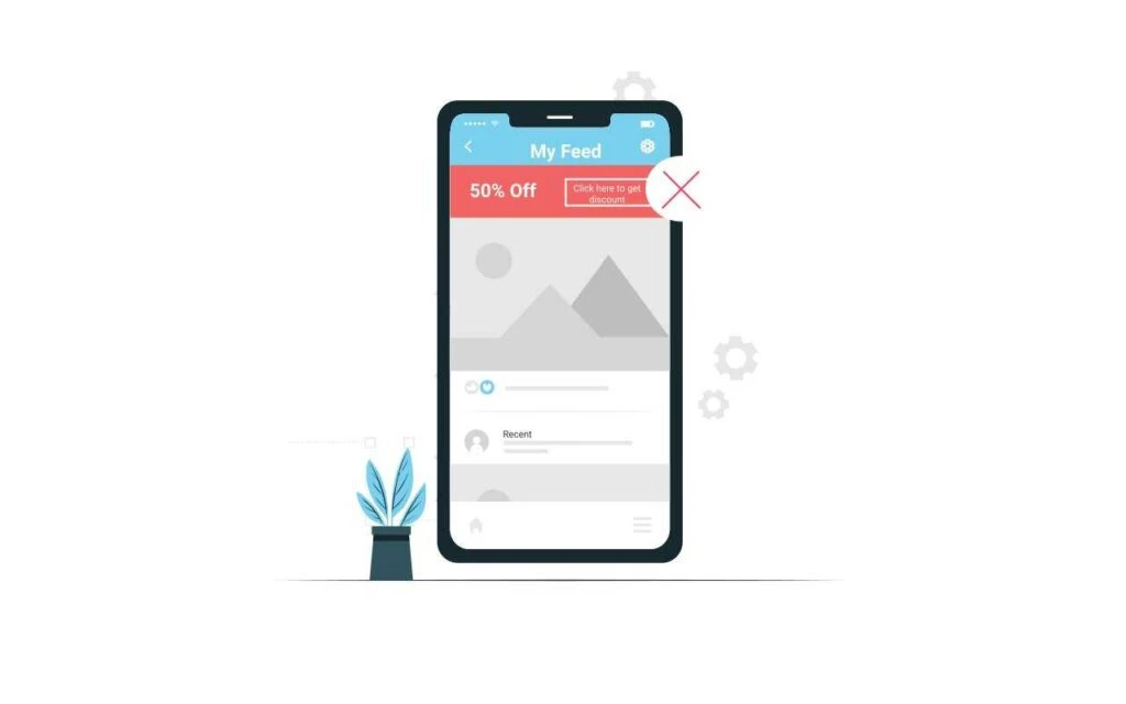
If you browse through websites, you will discover some websites employ dark patterns by crafting a user interface aimed to trick users into doing something they don’t want. You will find it in either an ad or a call to action that pops in brightly colored buttons with positive affirmations on specific websites such as insurance. The ultimate goal is to increase the traffic and trick users into signing up for recurring subscriptions.
In this technique, designers often focus on the built-in expectations of customers and play around with people’s fears. But, we recommend you not prioritize your business over your users. Instead, pinpoint opportunities for people through your design to gain people’s trust. By pinpointing opportunities, we mean delivering value to users.
When users find value in your products they will automatically rush to your website and it will intersect with your business goal of traffic, engagement, and conversion.
Read Also: 10 Principles of UI Design as a Founder
What are the fundamental principles of UX design?
User Experience (UX) design plays a pivotal role in creating digital products and services that are not only visually appealing but also intuitive and user-friendly. The core principles of UX design serve as guiding beacons for designers and developers to craft experiences that resonate with users. Let’s delve into the fundamental principles of UX design that form the bedrock of exceptional user experiences.
1. User-Centered Design:
At the heart of UX design lies the concept of user-centeredness. As Steve Jobs once said, “You’ve got to start with the customer experience and work back toward the technology, not the other way around.” Placing the user’s needs, preferences, and behaviors at the forefront of the design process ensures that the final product aligns seamlessly with user expectations.
2. Simplicity and Clarity:
The words of Leonardo da Vinci, “Simplicity is the ultimate sophistication,” hold true in UX design. Keeping interfaces simple and uncluttered enhances usability. Clear navigation and intuitive layouts make it easier for users to interact with the product without feeling overwhelmed.
3. Consistency:
As Maya Angelou expressed, “You can’t use up creativity. The more you use, the more you have.” Consistency in design elements such as colors, typography, and icons fosters familiarity and builds trust. Consistent experiences across different sections of a product contribute to a cohesive and harmonious user journey.
4. Accessibility for All:
Tim Berners-Lee, the inventor of the World Wide Web, emphasized, “The power of the Web is in its universality. Access by everyone regardless of disability is an essential aspect.” Inclusive design ensures that people with disabilities can also engage with digital products effortlessly. Prioritizing accessibility from the outset widens the reach and impact of the design.
5. Feedback and Flexibility:
Bill Gates once remarked, “Your most unhappy customers are your greatest source of learning.” User feedback is a cornerstone of UX design. By actively seeking and incorporating user opinions, designers can refine and optimize the user experience. Additionally, designing for flexibility accommodates diverse user behaviors and needs.
6. Visual Hierarchy:
As per Paul Rand, “Design is the silent ambassador of your brand.” Visual hierarchy guides users’ attention to the most important elements on a page. Through strategic use of size, color, and contrast, designers direct users’ focus and ensure essential information is readily noticeable.
7. Fast and Responsive Performance:
A quote from Indra Nooyi, former CEO of PepsiCo, resonates: “Performance with purpose.” In UX design, this translates to delivering fast-loading and responsive experiences. Slow-loading websites or apps can lead to frustration and abandonment. Prioritizing performance enhances user satisfaction and engagement.
8. Emotional Resonance:
Design legend Don Norman remarked, “Emotion comes from experiencing the product, from using the product.” Beyond functionality, UX design should evoke emotions that resonate with users. Positive emotions associated with a product lead to increased loyalty and advocacy.
9. Continual Iteration:
As Reid Hoffman, co-founder of LinkedIn, said, “If you are not embarrassed by the first version of your product, you’ve launched too late.” UX design is an iterative process. Regularly gathering data, analyzing user behavior, and making improvements based on insights ensure that the design remains effective and relevant.
In the words of Dieter Rams, “Good design is making something intelligible and memorable.” The fundamental principles of UX design underscore the importance of creating experiences that are user-centric, elegant, and impactful.
Why are UX design principles important in product development?
In today’s highly competitive digital landscape, creating products that resonate with users and provide exceptional experiences is crucial for the success of any business. This is where User Experience (UX) design principles come into play. UX design focuses on enhancing user satisfaction by improving the usability, accessibility, and overall interaction between users and products. Let’s delve into the significance of incorporating UX design principles in product development:
1. Enhanced User Satisfaction
As the renowned Steve Jobs once said, “You‘ve got to start with the customer experience and work back toward the technology, not the other way around.” This quote highlights the essence of prioritizing user satisfaction. By adhering to UX design principles, products are tailored to meet users’ needs, preferences, and pain points. This results in products that are not only functional but also enjoyable to use, leading to higher user satisfaction and long-term loyalty.
2. Reduced Bounce Rates
“Design is not just what it looks like and feels like. Design is how it works,” eloquently stated by Steve Jobs. When products are thoughtfully designed with UX principles in mind, they are intuitive and easy to navigate. This reduces the likelihood of users leaving the product prematurely, also known as a “bounce.” A seamless and enjoyable user experience encourages users to explore the product fully, increasing engagement and conversions.
3. Optimized Accessibility
The words of Tim Cook, Apple’s CEO, resonate here: “We believe that a beautiful design can also be accessible to everyone.” UX design principles emphasize inclusivity and accessibility. By considering various user abilities and providing user-friendly interfaces, products become accessible to a wider audience, including individuals with disabilities. This not only expands the user base but also demonstrates a commitment to social responsibility.
4. Iterative Improvement
“Design is not for philosophy—it’s for life,” said Issey Miyake, a renowned designer. In product development, continuous improvement is key. UX design principles encourage an iterative approach, where products are refined based on user feedback and changing market trends. This leads to products that evolve with the users’ needs, staying relevant and maintaining a competitive edge.
5. Competitive Advantage
Elon Musk once stated, “The first step is to establish that something is possible; then probability will occur.” Incorporating UX design principles sets a strong foundation for creating innovative and user-centric products. Such products stand out in the market, attracting more users and gaining a competitive advantage. Businesses that prioritize UX design differentiate themselves by offering exceptional value through superior user experiences.
6. Cost and Time Efficiency
The words of Thomas Edison underscore the significance of efficiency: “There’s a way to do it better—find it.” UX design principles involve thorough user research and prototyping before the actual product development begins. This reduces the chances of costly redesigns and rework later in the process. By identifying and addressing usability issues early on, businesses save both time and resources.
7. Customer-Centric Approach
“Your most unhappy customers are your greatest source of learning,” remarked Bill Gates. UX design principles advocate for understanding users deeply and empathizing with their needs. This customer-centric approach fosters a strong connection between the product and its users. By prioritizing user feedback and preferences, businesses can build products that resonate and create lasting relationships.
In conclusion, incorporating UX design principles into product development is not just a trend; it’s a necessity. From enhancing user satisfaction and engagement to gaining a competitive advantage and optimizing accessibility, UX design principles empower businesses to create products that truly make a difference in users’ lives. As the great minds mentioned above have emphasized, putting the user at the center of design thinking is the key to success in today’s dynamic and user-driven market.
Differences Between Product Design and UX Design
The two most confusing jobs in this preset era are that of a product designer and a UX designer. It is not easy to understand the difference because of the myriad of similarities both have. In many industries, the terms are interchangeable, leading to more bafflement and confusion.
This is why most people choose the wrong career and repent in the future. They don’t have clarity about these subjects concerning the roles and responsibilities, salaries, and future job prospects. Keeping this in mind, we have discussed some major differences everyone should know about a product and UX designer.
This article will clarify and help you choose the best product or UI/UX design company from an employer’s perspective. After all, ending up with the wrong choice will lead to not only a waste of time and money but may jeopardize the user experience or product.
What are product design And UX design?
As the name suggests, product design is the process through which a new product is designed from scratch to meet customer requirements and market expectations. The design process involves multiple steps, from brainstorming ideas to testing prototypes and deploying the same for production. For example, when a company decides to launch a new mobile, the first phase is the design process.
UX defines the user experience, i.e., how the user will feel using the product. It can be satisfactory, impressive, worst, and so on. Therefore, UX is concerned with the users’ psychology and behaviors. It is very important for the UX design company you have hired to carefully study the consumer market and understand what they are expecting.
Failure to gather knowledge on this matter can lead to further problems as they won’t be able to understand how several notches can take up the UX. In addition, it may lead to product failure post-release into production and the market. For this reason, companies must pay close attention to the UX design process.
How the product or UX Design is Carried Out?

A product or UX design process is divided into six steps, which are:
- Idea generation: In this phase, designers gather and study different documents on requirements or expectations. They share ideas and opinions through brainstorming. These ideas are then filtered, and only one is chosen that sounds to be the closest to the requirement.
- Product definition: In the next step, the designers define different attributes of the product or UX attributes. If it is software, the designer will define its UI elements, the number of pages it will have, layouts, color configurations, and so on.
- Prototype formation: The most important step of product and UI design is prototyping, where the professionals convert the design into a real-time prototype.
- Initial design phase: The prototype is approved and sent for production. Most companies start with small batches to reduce the losses later on if the product or UX fails to draw in the expected revenues.
- Testing and validation: Once the samples are ready to be released into the market, different testing processes are initiated, like performance testing, load testing, and so on.
- Commercialization and marketing: The samples are released into the market for users in this step. Marketing strategies are implemented to commercialize the product.
What are the roles and responsibilities of a product designer?
A product designer supervises and carries out the entire product design phase. Therefore, as an employer, you should ensure the person you hire is proficient enough. Following are the responsibilities of a product designer, which you should be aware of:
- Product designers conduct an array of market research. It helps them to understand the most important areas where there is a gap.
- They are also concerned with transforming the knowledge they gained from the research into ideas and opinions.
- Product designers gather ideas from others, like marketers, analysts, etc. They are concerned with brainstorming the gathered opinions to reach a specific conclusion.
- They also work on defining the attributes of the product and several other restrictions to be followed for product designs.
- The product designers work closely with the design team and offer their inputs and feedback to ensure the final prototype is up to the mark.
- They use different types of 3D modeling software like CAD and CAM to come up with the best design for the sample. This design is then sent to the production factory to create the first batch.
- Gathering the produced samples and running different kinds of testing is also one of the major responsibilities of the product designers.
- A product designer needs to know more about design techniques, research tools, materials, etc.
What are the roles and responsibilities of a UX designer?
The following are the major roles and responsibilities of the UX designer:
- UX designers are concerned with transforming designs into prototypes, mockups, flowcharts, and wireframes.
- They understand the client’s requirements and facilitate the same in the form of sketches and designs to ensure they can get the green signal in one go.
- The UX designers are also concerned with providing feedback and deeper insight into the user stories and experiences.
- They analyze the designs and check the areas where the error is present. Accordingly, they work closely with the product design team to form a perfect solution for the problem.
- UX designers solely focus on the design aspects that will help elevate the user experience and satisfy the user post-launch of the product. It can be the UI of the software, the performance of a car’s engine, and so on.
- They are responsible for planning new ideas and taking risks to ensure the prototypes are innovative and different from the competitors.
How to hire the best product or UX design company for your business?
Regardless of whether you need the product of UI/UX design services, you need to select the best company that can live up to your expectations. Here, we have explained a few tips to help you easily select a professional.
- First of all, you need to look into the experience earned by the professional. A product of UX designer needs to be proficient enough in work and should have hands-on knowledge about the field for at least two to three years.
- Go for a reputed UX design company or a product design company. This will help you avoid most of the challenges once the product is released into the market.
- Consider the project budget. No matter how good and lucrative the claims sound, you cannot exceed the budget.
- Ensure to check the skillset of the product and UX designers. They need to be creative and have proper market knowledge about consumer behavior.
- They must know how to analyze different datasets and utilize the same information to create the most innovative solution.
Now that you know the differences between a product designer and the UX designer choose the best web and mobile app development company to get the world completed. Also, ensure the UX or the product meets the market expectations perfectly so that you don’t suffer from reduced online reputation and popularity.
Final Word
When it comes to UX/UI in designing, understanding your audience’s expectations is the best way to begin. And, for gaining a better understanding you can co-relate the psychological principles of UX mentioned above. They will help you to keep the right mindset while designing and thus achieve the needed practicality.
If you are also struggling to build amazing UX/UI designs, consider checking Graffersid- a Top UI/UX design company, based in Indore. Here you will find an experienced team of designers who create stunning designs while keeping your business goals and customers’ expectations in mind. You can contact us here to get a quote or for a quick inquiry. We will be happy to assist you!