About the Client
SaniFrag came out during tough times. The world was going through a historic pandemic and needed the Healthcare Industry to step up and help everyone in this fight against deadly viruses. Founders of the SaniFrag wanted to serve the community with true values.
Irrespective of the presence of already a number of sanitizers, SaniFrag was different due to the quality of the product. With a wide variety of products in production, the sanitizer was the first one to come into the market. SaniFrag started slow but caught the pace when people started loving it.
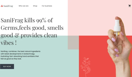
The website won the award of “Best User Interface for a Product Based Solution” after the launch of the website. The core focus of the development team was to enable SaniFrag to express the brand values through the design.
Features of the SaniFrag Landing Page
SaniFrag landing page has to show, the care, love, and support that brand personified with. GRAFFERSID has previously worked with brands that are dedicated to the community. Bringing simplicity and presenting the information in a seamless way was our core objective.
Going through the best existing pages of the products, we conducted intensive research to explore all possibilities. With almost 15 years of combined experience of the UI team, we were able to comprehend the brand in the prototype itself.
Getting an appraisal on the prototype design, we further initiated the landing page development process.
1. Long Scrolling
There are various options in front of developers for the presentation of content on a landing page however the decision solely depends on the experience of users. As a website development company, GRAFFERSID has worked with projects having different scroll patterns, thus keeping in mind the requirements of the users the team decided to incorporate a long scrolling pattern helping to incorporate content without any congestion on the landing page.
2. Dark Mode
At GRAFFERSID we believe that the small things matter as much as the big things. Features like dark mode are often overlooked by both developers and companies asking for a landing page or mobile app development.
But according to our research, a substantial number of visitors on a page appreciate dark mode and that is why the development team has incorporated this feature to make the page more surf-able even in late-night hours.
3. Search Engine Optimisation
With the team of our dedicated developers who are well versed in not only website development and design but also niche concepts like SEO. The landing page developed by the team facilitates the faster and more accurate implementations of on-page SEO.
The landing page has been integrated with plugins that automate a large chunk of search engine optimization tasks for the client company. While the admin panel created by the backend development team allows the administrators to easily monitor these strategies.
4. Responsiveness
The number of users accessing the Internet with the help of the mobile phone has seen a humongous growth in recent years. Aware of this development, the UI/UX designing team at GRAFFERSID has kept responsiveness as one of the top priorities while developing the landing page.
While the developer’s team has ensured that the landing page performance is completely optimized for mobile phone viewing with the help of language like Bootstrap.
5. Product Oriented Design
For our UI/UX design and development team at GRAFFERSID, the job isn’t just to design websites and landing pages but to create platforms that bring results for the clients.
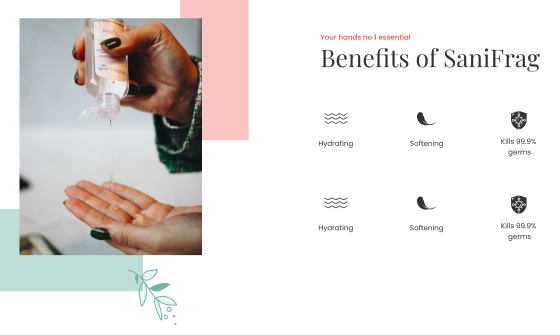
The landing page is designed for a client that manufactures sanitizers, thus the team focused on creating a design that presents a picture of health and wellness in the minds of the visitors.
6. Unique Color Pattern

Being an experienced UI/UX design company, we at GRAFFERSID understand the importance of standing out among the crowd. Hence the design team chose the color pallets and patterns that are original to the landing page.
While the team has also focused on aligning the color pattern with the overall brand appeal of the client as well as their social media marketing strategy. This approach helps the visitors to have a consistent image of the client in their minds while surfing different platforms.
7. Attractive Typography
The typography of a landing page or website is a crucial part of the development process as it has a direct impact on the readability factor of the page. Also, the typography is selected keeping in mind the viewing experience of the visitor in the dark mode.
The team has selected a typography pattern based on extensive feedback regarding factors like the number of typefaces, alignment, and size of the text.
8. Thumb Zone Compatible Design
Having worked on a large number of custom mobile app development projects, the GRAFFERRSID team is well aware of the importance of thumb zone compatibility. Whenever a user accesses a website or page through their mobile phone the most important elements must be within the thumb zone of the user for easier access.
9. Micro Interactions
Working with animations and effects has always been a strong point for GRAFFERSID. Leveraging the experience and skills of our developers, the landing page is laced with fine details that make the user experience more aesthetically pleasing.
This includes the usage of the landing page loading effects or pull-down effects. Additionally, these micro-interactions provide a sense of control to the users and keep them engaged in between the transitions.
10. High-Quality Graphics
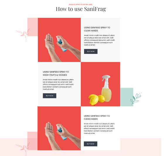
Graphics and images speak more than plain text while also making the process of user engagement more effective for the landing page. That is why the team has used graphics that are unique to the brand of the client.
Further, the team has also ensured that the graphics and images are original so that there is no dispute regarding the ownership of these graphics in the future.
11. Dynamic Testimonial Slides
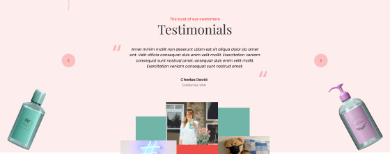
Nothing builds integrity for a company more effectively than validation from real people. Hence the team has decided to lace the landing page with dynamic testimonial slides that include ratings and experience for customers.
However, what makes it unique is the auto slider effect which keeps the testimonials rotating with a preset time interval which saves the effort of the user in checking the reviews manually.
12. Server and Backend support
Apart from the external aesthetics of the website, it is equally important that the actual performance of the landing page is at its optimum. The backend team has used backend technologies to ensure that the servers can work as efficiently as possible.
While the data structures have been designed to ensure that the client needs minimum server space for managing the landing page and sites.
13. Easy Navigation
While the landing page hosts multiple elements it becomes necessary that there is navigational freedom and clarity for the user. To ensure the implementation of this goal, the team has created a navigational assistant for the page that works in the form of a button.
It works as a static tool that remains fixed while the users scroll the website. Clicking on it opens a basic outline of the page from which the user can select the desired location.
14. Page Speed
One of the main aims of effective website development is curtailing the bounce rate numbers of the landing page or website. To ensure this the developers have worked on ensuring the optimum speed for the landing page by eliminating bugs and integrating plugins that help the page to perform well in stressful situations.
While this also ensures that the landing page gets a high ranking on the search results of various search engines.
15. Extensive Testing
While a project may perform normally under the development conditions, it does not guarantee that the page or website will perform similarly in real-life conditions.
This may happen due to variations in traffic load and data speeds. To mitigate this problem, the team has done extensive testing of the landing page under stressful situations. This has ensured the optimum performance of the page even with the high traffic load or low data speed conditions.
16. Symmetrical Layout
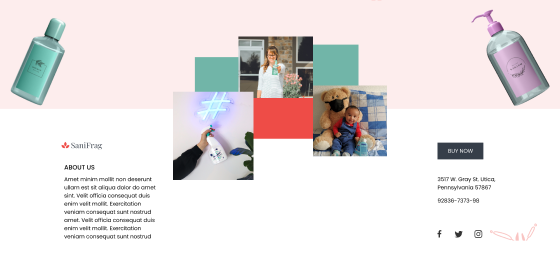
Coming to the layout of the landing page, the designers preferred a symmetrical layout for the page based on the Gestalt Principles. GRAFFERSID has always tried to hire developers who are not only experienced in technical aspects of web design but also in the psychological aspects.
The symmetry on the page provides a sense of order and cleanliness for the user helping them to avoid distraction while surfing.
17. Cross-browser compatibility
The browser a visitor uses to surf the landing page has a big role in the visual experience of the website. Every browser follows an HTML protocol that is slightly different from its counterparts which makes the landing page look different on different browsers.
The team has ensured that the landing page is completely compatible with all the popular browsers through debugging and making changes to the front-end code.
18. Social Media Integration
Every landing page is a part of the overall digital marketing strategy of business focused on bringing in new leads. However, the biggest source of these leads is social media platforms where the majority of internet surfers spend their time.
Keeping this in mind the team has integrated the links to the social media pages of the client in form of buttons on the footer. This gives the user an option to reach the social media page of the business just with one click.
19. Security
The landing page is designed to generate further leads for the client business which requires the collection of user information. But at the same time, such information must be protected from malicious third-party access.
To ensure this the team has used standard security protocols like HTTPS which gives complete encryption of data that travels between the servers and the landing page.
Further, the landing page is integrated with an alert system that notifies the administrator about any cyberattacks on the page.
What did the Client say about Collaboration with GRAFFERSID?
Working with GRAFFERSID has been an absolutely amazing experience. The development process was easy and effortless. They have got plenty of experience in crafting websites with high-quality designs and User Experience. I am very thankful to the team of GRAFFERSID for helping us reach the market within our timeline.
