About the Client
One of the best uses of modern technology is clearly visible in the Sports Industry. With next-gen real-time broadcasting and live streaming, it is an ever-growing and advancing Industry. At the core of this phenomenal growth, lies Data.
Capturing valuable data and churning it to drive revenue forward is the business model of most of Sports Companies. Founders of this Sports Data Management company spotted the crucial need of multinational enterprises and created a system that offers the businesses reliable and correct data and analytics to drive their growth.
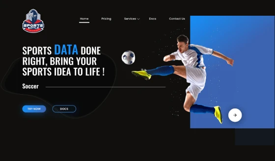
Creating a landing page for this sophisticated business required a deep understanding of the industry and elements. The team of GRAFFERSID worked intensively in crafting each and every element of the website and bridging the dynamic nature of the Sports Industry.
Catering to a different set of audience, UI/UX design and development was different than others and were crafted with help of Industry experts.
Features of the Sports Battle Landing Page
Generally, Sports platforms are filled with stunning visuals and appealing graphics all around. This client was catering to sports across industries and therefore creating a generic platform was challenging.
Having filters to search out and find the exact thing the user wanted was the important part. Simplifying the journey for the users along with having a lot of features was the unique point of the website.
1. Eye-Catching Graphics
If we see in the context of modern website development, a major part of a landing page is covered by the graphics. Hence it becomes crucial that the graphics are high quality and in line with the business of the client.
Keeping this in mind the developers at GRAFFERSID leveraged various premium graphic services and chose them based on their correlation with the overall feel of the website.
These graphics have also helped in holding the attention of the audience toward important elements like CTA thus increasing the chances of conversion.
2. CTA Buttons
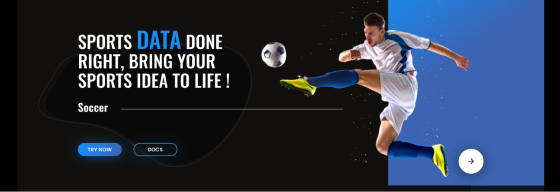
As a website development company, GRAFFERSID has created innumerable website landing pages for businesses operating in a myriad of Industries. However, they all share a common goal, which is bringing in conversions for the businesses.
The design team after a great deal of research has come up with custom button designs that stand out. Further, the frontend team has leveraged its previous experience and placed the calls at optimum positions that are most likely to get hits.
3. Navigation Bar
The sports landing page has been designed to keep the user experience easy despite the presence of different sections. The upper navigation bar is created to serve this purpose, here the user can find links to various sections of the landing page.
The UI/UX designing team has ensured that the navigation bar typography is simple and the bar itself provides clear linkage to other parts of the page. Further, the buttons providing a list of links are created with a shutter effect to make them save space on the page and maintain a clean layout.
4. Hover Effects
Although the hover effects are usually counted among micro-interactions in a landing page, they are one of the most popular features still today. However, there have been numerous developments in the cursor effects and the dynamics and purpose of them have completely changed now.
The UI/UX design and development department along with the developers working on the frontend structure has created a unique synergy with these effects, adding further interactivity to the page.
5. Dynamic Slides
Earlier in the day most of the sites and landing pages used to contain just static elements but as the times changed and new languages arrived there has been a lot of usage of dynamic elements.
As a UI/UX design company GRAFFERSID has worked with these technologies to provide a much better interaction with the visitor.
The page has been integrated with dynamic sliders that can be used to display banner ads and graphics. Additionally, the content of the slide can be changed regularly which provides flexibility to the client.
6. Long Scrolling
The diversity among the type of landing pages also requires each of them to be adorned with a compatible scrolling pattern. By focusing on user behavior and expectations, the team decided to use the long scrolling system making the entire surfing experience effortless.
While as mentioned earlier, there is also a navigation panel that acts as an assistant in case the user does not want to scroll and get directly to a particular section.
7. Event Manager
The client business is mainly focused on providing sporting event management services to their customers. To facilitate this purpose, the development team has come up with a unique feature called event manager.
To come up with this idea, the developers leveraged their experience of working with mobile app development. An event manager is a simple tool that can be used to create an outline of a sporting event and various dates relating to it, acting as a freebie aimed at convincing visitors into leads.
8. Chatbot
Whether you want a website or custom mobile app development services, the chatbot feature has become a must. The GRAFFERSID developers team has integrated the landing page with a chatbot capable of conducting conversation and storing the chat data for future reference.
The chatbot uses advanced technologies like AI, NLP, and machine learning to ensure that it provides the most accurate assistance to each visitor.
9. Social Media Integration
Keeping the landing page integrated with various digital platforms of the client was one of the main focuses for the team. Hence the page was integrated with all the popular social media pages of the client through custom-designed buttons strategically placed at the footer of the page.
Additionally, the admin panel of the page’s inbuilt traffic analyzer also shows the number of visitors coming to the landing page via the social media platforms and vice versa.
10. Search Engine Optimisation
Search engine results are the prime source of new visitors to the site hence the page needs to be built keeping in mind the SEO optimization factor.
The dedicated developers’ team at GRAFFERSID used the frontend principles necessary to optimize a site for search engine rankings.
Additionally, the landing page has been integrated with custom plugins that make it easier for the client to maintain their overall SEO campaign.
11. Fade and Focus
While working on the visual appearance of the landing page, the design team proposed the idea of using a fade and focus approach. This provides an amplified impact on the visitors while checking out a particular element through combination fade and focus effects.
Further, the backend team made improvements in the code to ensure that the core working of the site isn’t affected by this.
12. Data and Insights
To measure the ROI of the digital marketing plan of a business, proper key performance indicators must be already put up in place. That is where the importance of data and insights come into the picture.
Through its data and insight feature, the landing page ensures that the client is provided with all the data related to the visitors in one place. Also, this data can be exported by the user to get further insights into user behavior.
13. Lead Capture Form
Serving its main purpose of getting leads for potential conversions, the landing page has been laced with a lead capture form.
Unlike the old approach, the form covers only a part of the screen to ensure that the visitor’s experience is not hindered in any way.
Besides it also contains an autofill option that can get the user to fill the form with their google account information if the permission is granted.
14. Optimum Color Contrast
The size and quality of displays vary widely which becomes a huge problem when considering the visual appearance of the website. Hence the team has tested the landing page on a wide range of devices including both computers and mobiles.
Likewise, the design team has also incorporated the concepts of color psychology into the overall color choice of the landing page to target a specific audience who are most likely to be interested in the client’s products.
15. Custom Illustrations
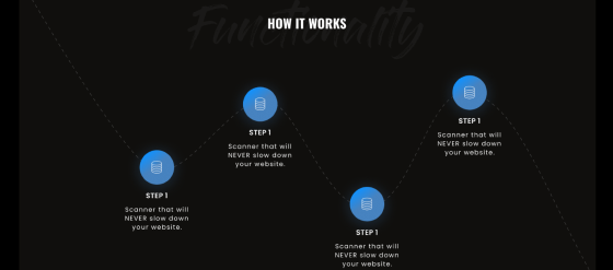
Although there were plenty of readymade options available in front of the UI/UX team regarding the illustrations on the landing page, still the team chose to include custom ones.
This is because the designers wanted to add a unique flair to the page helping it to stand out among the competitors. Also, a few of these illustrations have been used as animations to make the overall look more aesthetically appealing.
16. Liquid Layout Design
On the transition end, the design team wanted to keep things as smooth as possible and this was made possible with a great collaboration between the designers and developers.
The liquid layout design provided on the landing page gives an effortless feeling to the user while making the transition between various elements.
The feature was thoroughly tested under realistic situations to ensure that it performs similarly with different environments and devices.
17. Cross-browser Compatibility
When it comes to the fundamental features of a landing page, the cross-browser takes an important space. As there is a wide range of devices, similarly there is a decent range of browsers that can be used to access the landing page.
To ensure that the page performs similarly with all the popular browsers, the developers team has done the A/B testing of the page with various browsers while making necessary changes in the code.
18. Security
With all these data traveling around the web, it becomes necessary that there is security for this information from unwanted third-party access. The GRAFFERSID developers team has ensured that the page is laced with encryption features like HTTPS.
This warrants that all the data traveling between the servers and the landing page is completely encrypted. Also, the alert system provided notifies the client about any cyberattacks done on the landing page.
What did the Client say about Collaboration with GRAFFERSID?
We were amazed to see the passion of the team in the project. After working with other IT service companies, we had bad experiences.
GRAFFERSID is unlike any other Development company. Their onboarding processes, discussions, and meetups are all focused towards making the project a hit.
We got the deliverables within our timeline and with absolute perfection. This team helps startups in a complete way and understands their growth curve. Thanks for creating a perfect website for our idea.
