Key UI/UX Elements Every Web App Must Have in 2026

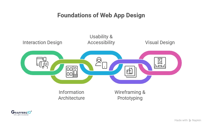
1. Interaction Design (IxD): Creating Smooth and Intelligent User Interactions
Interaction design focuses on how users engage with your product. Micro-interactions (like button feedback or animations), real-time responses, and AI-driven interactions (chat, suggestions) make the experience feel fast, intuitive, and human-like.
2. Information Architecture (IA): Structuring Content for Easy Navigation
Information architecture defines how your content is organized and presented. A clear structure, logical hierarchy, and well-defined user flows help users find what they need quickly, reducing friction and improving engagement.
3. Visual Design: Making Your Interface Clean, Consistent, and Engaging
Visual design is about creating a strong first impression while supporting usability. Clean layouts, proper use of whitespace, and consistent branding ensure your product looks professional and guides users naturally through the interface.
4. Wireframing & Prototyping: Testing Ideas Before Development
Wireframing and prototyping allow you to validate concepts before building the final product. Early testing helps identify usability issues, speeds up iteration, and reduces development costs. Common tools: Figma, Framer, and AI-powered prototyping platforms
5. Usability & Accessibility: Ensuring Everyone Can Use Your Product Easily
A successful web app must be easy to use for all users. Mobile-first design, fast loading speeds, and accessibility standards (like WCAG) ensure your product is inclusive, responsive, and performs well across devices and user groups.
Key UI/UX Metrics to Track in 2026 (How to Measure User Experience Success)
To understand whether your UI/UX is actually driving results, you need to track the right metrics. In 2026, this goes beyond basic analytics; modern products combine user behavior, usability, experience, and AI performance data.

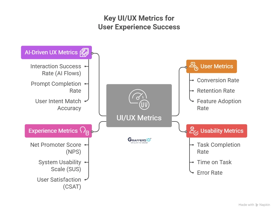
1. User Metrics (Measure Growth & Adoption)
These metrics show how users interact with your product at a business level.
- Conversion Rate: Measures how many users complete a desired action (signup, purchase, demo request). A strong UI/UX reduces friction and directly improves conversions.
- Retention Rate: Tracks how many users return over time. Good UX ensures users find continuous value, which increases long-term engagement and reduces churn.
- Feature Adoption Rate: Shows how often users engage with key features. If adoption is low, it usually indicates poor discoverability or confusing design.
2. Usability Metrics (Measure Ease of Use)
These metrics help evaluate how simple and efficient your product is to use.
- Task Completion Rate: Indicates the percentage of users who successfully complete a task. A low rate signals usability issues or unclear workflows.
- Time on Task: Measures how long users take to complete an action. Faster completion usually means better UX, unless complexity is required.
- Error Rate: Tracks how often users make mistakes (wrong clicks, failed submissions). High error rates point to design flaws or unclear instructions.
3. Experience Metrics (Measure User Satisfaction & Perception)
These metrics capture how users feel about your product.
- Net Promoter Score (NPS): Measures user loyalty by asking how likely users are to recommend your product. A high NPS reflects a strong overall experience.
- System Usability Scale (SUS): A standardized score that evaluates usability. It provides a quick benchmark to compare UX quality across products.
- User Satisfaction (CSAT): Direct feedback from users about their experience. Helps identify pain points and areas for improvement.
4. AI-Driven UX Metrics (New in 2026)
With AI-powered interfaces becoming standard, new metrics are needed to evaluate intelligent experiences.
- Interaction Success Rate (AI Flows): Measures how often AI-driven interactions (chatbots, assistants) successfully complete user requests without human intervention.
- Prompt Completion Rate: Tracks whether users get meaningful results from their inputs/prompts. Low rates indicate poor AI understanding or UX gaps.
- User Intent Match Accuracy: Evaluates how accurately the system understands and responds to user intent. This is critical for conversational UI and personalized experiences.
How UI/UX Affects SEO Rankings and AI Search Visibility in 2026
Modern search engines and AI systems no longer rank pages based on keywords alone; they evaluate how users experience your website. A strong UI/UX directly improves both SEO rankings and visibility in AI-powered results like AI Overviews and voice search.

Key UX Factors That Directly Impact SEO Rankings
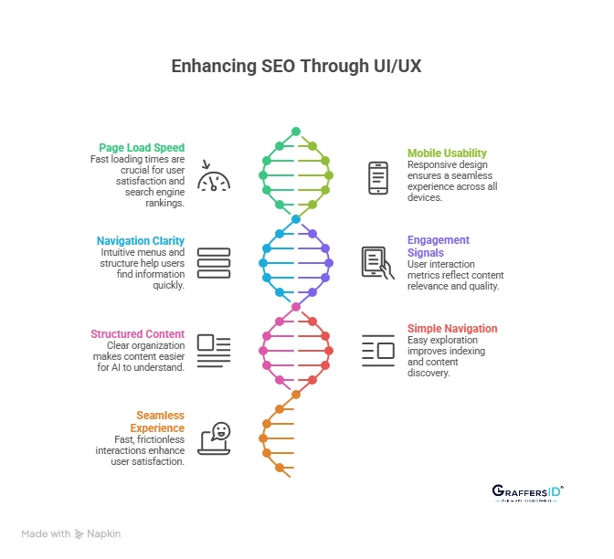
1. Page Load Speed (Core Web Vitals)
- Fast-loading pages are critical for both users and search engines. If your site takes more than a few seconds to load, users leave, sending negative signals to search engines.
- Google’s Core Web Vitals now prioritize speed, responsiveness, and visual stability as ranking factors.
2. Mobile Usability (Mobile-First Indexing)
- Search engines primarily evaluate the mobile version of your website. A responsive, mobile-friendly design ensures users can easily read, navigate, and interact across devices.
- Poor mobile UX can significantly lower rankings and reduce engagement.
3. Navigation Clarity (User Journey Optimization)
- Clear menus, logical structure, and intuitive navigation help users find information quickly. When users don’t struggle to navigate, they stay longer and explore more pages.
- Search engines interpret this as a positive experience signal, improving your rankings.
4. Engagement Signals (Behavioral SEO Metrics)
- Metrics like bounce rate, time on page, and pages per session reflect how users interact with your site.
- If users stay longer and engage more, it signals relevance and quality, helping your site rank higher in both traditional and AI-driven search results.
Read More: How Does Website Design Impacts SEO and AI Search Rankings in 2026? Key Factors for AI Search, Visibility & Conversions
What Google and AI Search Systems Prefer in 2026
1. Structured and Well-Organized Content
- Content that is clearly structured with headings, bullet points, and concise sections is easier for AI systems to understand and extract.
- This increases your chances of being featured in AI Overviews, featured snippets, and answer boxes.
2. Simple and Intuitive Navigation
- Websites that are easy to explore allow both users and AI crawlers to understand content relationships better.
- A clean structure improves indexing and ensures your key pages get discovered and ranked.
3. Fast, Seamless User Experience
- Speed is no longer optional; it’s a baseline expectation. Fast, frictionless experiences improve user satisfaction and reduce drop-offs.
- AI systems prioritize websites that deliver consistent, high-quality experiences across devices.
Read More: 10 Essential Web Design Features for a High-Impact Website
Consequences of Poor UI/UX Design (What Happens If Your Website Has Poor UI/UX)
Poor UI/UX is not just a design issue; it directly impacts your traffic, conversions, and revenue. Here’s what typically happens when the experience is not optimized:
1. High Bounce Rate (Users Leave Instantly)
- If your website feels confusing, slow, or cluttered, users leave within seconds without exploring further.
- This sends negative engagement signals to search engines and AI systems.
2. Low Conversion Rates (Lost Sales Opportunities)
- Poor navigation, unclear CTAs, or complex user flows create friction in the user journey.
- Even interested users drop off before completing actions like sign-ups or purchases.
3. Poor SEO & AI Search Visibility
- Search engines in 2026 prioritize user experience signals like page speed, mobile usability, and engagement.
- Bad UI/UX lowers rankings in both traditional SERPs and AI-generated answers.
4. Negative Brand Perception (Loss of Trust)
- Users associate a poor interface with low quality or untrustworthy businesses.
- A bad first impression can damage credibility, even if your product is strong.
5. Higher Customer Churn (Low Retention)
- If users struggle to use your product, they won’t return.
- Competitors offering smoother experiences will quickly win them over.
6. Reduced Customer Lifetime Value (CLTV Impact)
- Frustrated users don’t explore features or upgrade plans.
- This directly reduces long-term revenue potential from each customer.
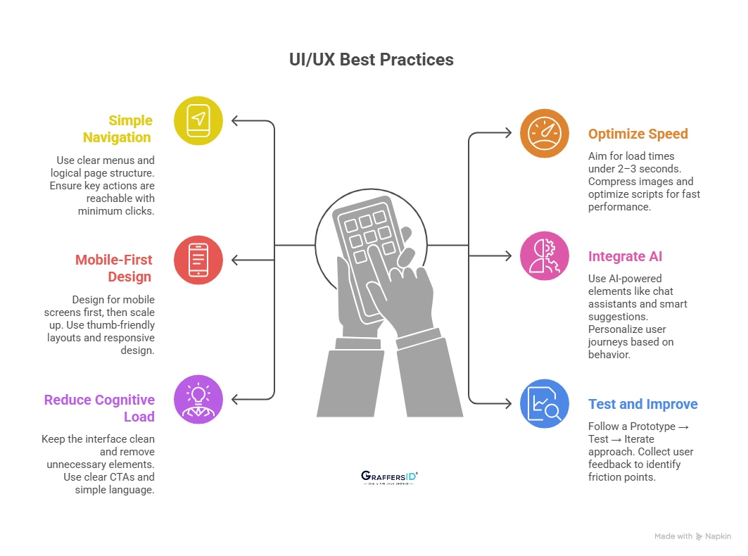
Best Practices for UI/UX in Web App Development in 2026

1. Keep Navigation Simple and Intuitive
- Use clear menus, logical page structure, and familiar patterns so users don’t have to “think” to navigate.
- Ensure users can reach key actions (signup, checkout, contact) with a minimum of clicks.
2. Optimize Website Speed and Performance
- Aim for a load time of under 2–3 seconds to reduce bounce rates and improve SEO rankings.
- Compress images, optimize scripts, and use modern frameworks to ensure fast, smooth performance.
3. Follow a Mobile-First Design Approach
- Design for mobile screens first, then scale up for desktop to match modern user behavior.
- Use thumb-friendly layouts, readable text, and responsive design across all devices.
4. Integrate AI Features for Better User Experience
- Use AI-powered elements like chat assistants, smart suggestions, and predictive search.
- Personalize user journeys based on behavior, preferences, and past interactions.
5. Reduce Cognitive Load for Users
- Keep the interface clean by removing unnecessary elements and visual clutter.
- Use clear CTAs, simple language, and focused actions to guide users effortlessly.
6. Test, Validate, and Improve Continuously
- Follow a Prototype → Test → Iterate approach before full development.
- Collect real user feedback early to identify friction points and improve usability.
UI vs. UX: Which is More Important in Web App Development?
Both are equally important. UI (User Interface) and UX (User Experience) are interdependent; focusing on one while ignoring the other leads to poor product performance.
1. Great UI + Poor UX = Visually Attractive but Frustrating
Your product may look modern and polished, but confusing navigation or slow flows drive users away. Result: High bounce rates and low conversions.
2. Great UX + Poor UI = Functional but Unappealing
The product works smoothly, but an outdated or unattractive design reduces trust and engagement. Result: Lower user retention and weak brand perception.
3. UI + UX Together = High-Performing Digital Product
A balance of usability and visual design creates seamless, engaging experiences. Result: Better conversions, retention, and overall product success.
Read More: How to Pick the Best Web Design Agency for Your Business Goals
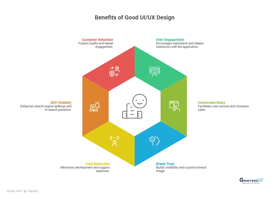
How UI/UX Design Impacts Business Growth?
- Increases Revenue and Conversions: Clear user flows and optimized interfaces reduce friction in key actions like signups and purchases. Result: Higher conversion rates and direct revenue growth.
- Improves Customer Lifetime Value (CLV): A smooth and personalized experience encourages users to return and engage more frequently. Result: Increased repeat usage and long-term customer value.
- Strengthens Brand Perception and Trust: Consistent, high-quality design signals professionalism and reliability to users. Result: Stronger brand recall and higher customer confidence.
- Creates a Competitive Advantage in Crowded Markets: When features are similar, user experience becomes the key differentiator. Result: Higher user preference and market positioning.

Conclusion: Why UI/UX Design is Critical for Web App Success in 2026?
UI/UX is no longer just about how your product looks; it’s about how your business performs. In today’s AI-driven, experience-first digital landscape, a well-designed web app doesn’t just attract users, it drives measurable growth.
A strong UI/UX strategy delivers higher user engagement, better conversions, improved SEO & AI visibility, and faster scalability. A poorly designed product may still function, but it will lose users quickly, reduce trust and credibility, and limit growth potential.
If you’re building or scaling a web app in 2026, investing in UI/UX early is one of the highest ROI decisions you can make.
At GraffersID, we help startups and enterprises design intuitive, conversion-focused UI/UX and build scalable web and mobile applications.
Contact us to build a high-performing product that users love and convert on.